WWDC 25: Build a SwiftUI App with the New Liquid Glass Design
With the new WWDC 25 announcements, SwiftUI gets huge promotion from it. As well as lots of technical improvements, the new Liquid Glass Design is connected to SwiftUI components and applications delightfully.
What we are going to talk about are:
- App Structure
- Toolbars
- Search
- Controls
- Liquid Glass Effect
For the detailed deep diving into SwiftUI new improvements and innovations, you can check out the our other article; WWDC 25: What’s New in SwiftUI.
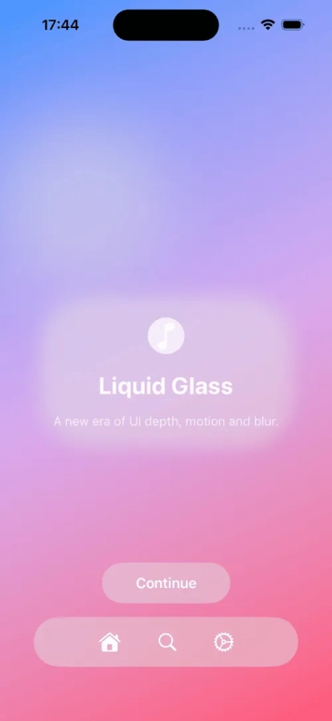
AppStructure is Reshaped
Applying the new Liquid Glass Design into the SwiftUI structure made the reimagining visuals. The views and modifiers like NavigationSplitView, Sheets and TabView were refined for the new design. These are the core parts of the navigation of the application. All of them now have blurry background effects. As well as this, tabviews now size animating with scrollable effects. This makes your main content more seeable and focusable instead of tabview. To achieve this, tabBarMinimizeBehavior and onScrollDown behaviour should be used.
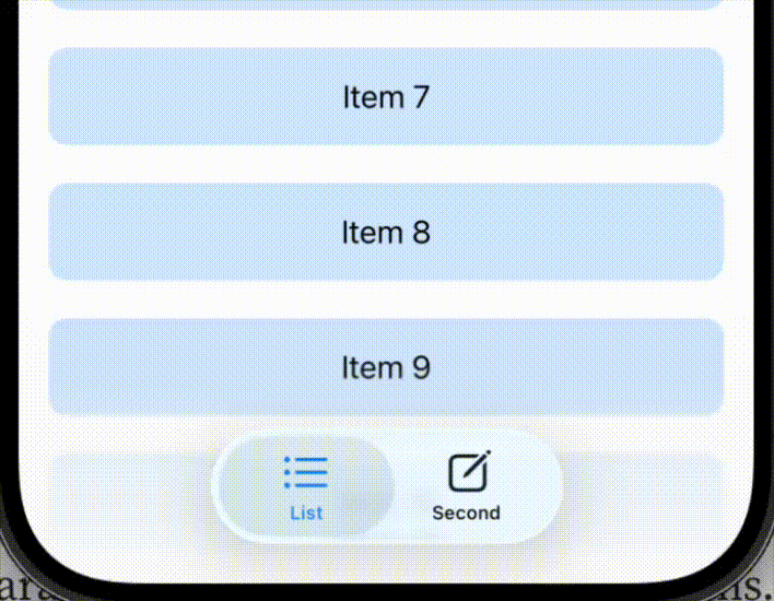
Toolbars Get Smarter
Toolbar changes look stylish now. With the Liquid Glass Design, the toolbar floats above the background content with a blurry effect on it. On scrollable views, it adapts itself according to the background object by changing its colour. To use this effect, the user should use .scrollEdgeEffectStyle(.automatic). Users can use .sharp or .subtle parameters too.
Including the new auto-grouping ability in the toolbar, it enhances the ability to create beautiful and user-friendly toolbars. The system toolbar back button is visually separated from the user’s custom buttons.
To separate the buttons inside the toolbar, we use “ToolbarSpacer()”. ToolbarSpacer can be used as either fixed or flexible via using ToolbarSpacer(minLength: )
struct DashboardDetailsView: View {
var body: some View {
ScrollView {
ScrollContent()
}
.toolbar {
ToolbarItem { HomeLink() }
ToolbarSpacer(.fixed)
ToolbarItem { FavoriteButton() }
ToolbarItem { ProfileButton() }
ToolbarSpacer(.fixed)
ToolbarItem { SearchToggle() }
}
}
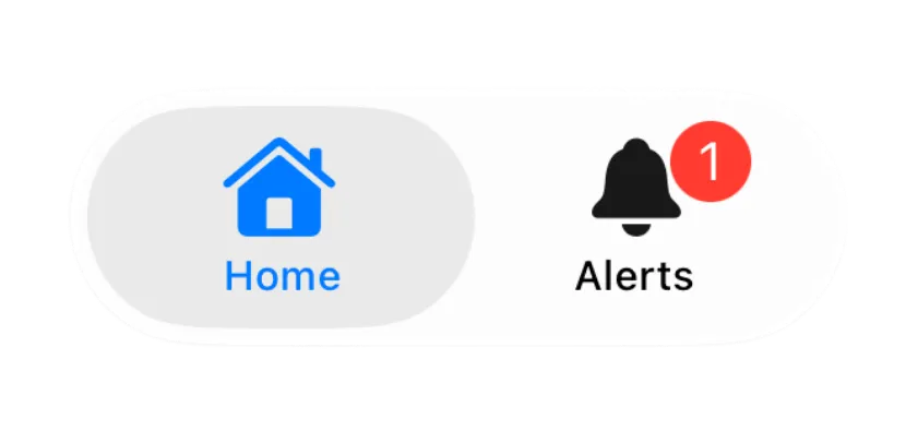
}
Another feature is .badge(1). Badge basically adds the notification bubble onto your button. The first idea that comes to mind to use this is with the bell icon, which is commonly used for notification buttons’ layer.
Toolbars now use monochrome tint to reduce visual noise. With this change, you can still use .tint(.blue) to intentionally change the icon’s colour.
Reinventing Search for the New Liquid Glass Design
Depending on the device size and the number of the buttons in the toolbar, on iPhone, the search button may minimise to a button in a toolbar. When it is tapped by the user, it still is working like half-screen search behaviour. The new update offers that if the user wants to achieve this, minimise the behaviour from the search button in the application, with the ability to use . searchToolbarBehaviour(.minimize).
SwiftUI offers a new search system that is more fluid and adaptive to a user-friendly experience. It offers two different patterns to work with.
1. Toolbar-Based Search
With this pattern, the search field is fixed to the bottom of the screen in iPhone devices to offer the user easy access to it due to its being closer to the user’s thumb. On iPad and Mac, it is still located at the top of the screen, top trailing corner.
To use this, we ought to use .searchable() now. If we want to use it globally, we need to apply this to the entire navigation content. This will let us search all the context, not just a column.
NavigationStack{
  ...
}.searchable(text: $searchText)
2. Search as a Dedicated Tab
If the application has multiple tabs on the toolbar and you don’t want to use the search feature in all of them, great news for you. Let’s say you have two tabs, home and categories, and a search tab in your tabbar. If you want to use search in the categories tab only, you should enter role: .search to Tab.
TabView{
  ...
  Tab(role: .search) {
    NavigationStack {
      TabContent()
    }
  }
}.searchable(text: $searchText)
When the categories tab is tapped, the search tab takes the area of the categories tab and acts like a normal search field, giving the user a strong experience.
| Toolbar-Based Search (iPhone) | Dedicated Search Tab | |
|---|---|---|
| Location of Search Field | Fixed to the bottom of the screen for thumb reach | Replaces the tab bar with a search interface |
| Activation | Via search icon in toolbar (may collapse into button) | Via tapping the tab assigned .searchRole(.search) |
| Search Scope | Applied globally when declared on parent navigation view | Applied only in that tab’s context |
| Layout Behavior | Appears above keyboard, overlays content below | Uses full screen, no overlay — feels native to the tab |
| Best Use Case | General browsing or when search is a global feature | When search is secondary, or scoped to one section (e.g., “Explore” tab) |
| Key Modifier(s) | .searchable() + optional .searchToolbarBehavior(.minimized) | .searchable() + .searchRole(.search) |
| Device Adaptation | Bottom on iPhone, top-trailing on iPad/Mac | iPhone: tab-to-search transition; iPad/Mac: field appears top-center |
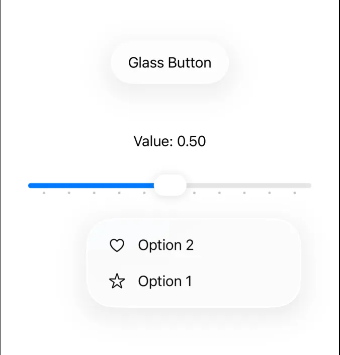
Controls are Refreshing & Responsive
The new design has refreshed the look for controls like buttons, sliders and menus. The changes are made for users to have the same familiar experience across all devices.
Buttons
- Bordered buttons have a curved corner capsule shape by default.
- In macOS, buttons now have size options of mini, small and medium. .buttonBorderShape() can be used to specify. Also, it supports the long-awaited large-sized buttons.
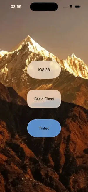
- For designing according to the new Liquid Glass design, the user can use buttonStyle(.glass)
Sliders
- Sliders now have tick marks like milestones. Ticks appear automatically when step parameters are initialised. Ticks can be located manually on the slider line as well with SliderTick(0.x).
Menus
- Menus now have a design reimagining. Icons that are located with the menu cell text are on the leading part in macOS.
In addition to the SwiftUI controls improvements and features, user controls are changing as well. Concentric rectangle shape is a new feature that, when applied to the view’s container, makes the views inside the container maintain the container’s shape.
CustomControl()
.background(.tint, in: .rect(corner : .containerConcentric())
Glass Effect in Custom Views
To add a glass effect to custom views, we are going to use .glassEffect(). It will add our custom view capsule-shaped background glass effect. To change the shape from a capsule, we will use .glassEffect(in: .rectCornerRadius: ). It is also to be designed by .glassEffect(.regular.tint(.green)). This will apply the tint to our view. SwiftUI provides interactions via animating the view by scaling, bouncing and shimmering in iOS devices by default.
Visual correctness and similarity are essential between the custom views and components that are applied by the glass effect when they are used together. To avoid inconsistent behaviours, Apple engineers suggest developers to use GlassEffectContainer. This prevents the unwanted behaviour by controlling the glass visual effects and grouping the components and custom views to make sure the similar glass effect is applied to them.
struct glassView: View {
    @Namespace var namespace
    @State var isTapped = false
    @State var badges = [BadgeData]()
    var body: some View {


        GlassEffectContainer {
          VStack {
            if isTapped {
              VStack(alignment: .center, spacing: 24) {
                ForEach(badges) { badge in
                    BadgeLabel(badge: badge)
                    .glassEffect()
                    .glassEffectID(badge.id, in: namespace)
                }
              }
            }
            BadgeToggle()
              .buttonStyle(.glass)
              .glassEffectID("badgeToggle", in: namespace)
          }
        }
    }
}
F.A.Q.
1) Can I mix the new design with my custom UI elements?
Absolutely. You can apply .glassEffect() to custom views and group them using GlassEffectContainer to ensure consistent reflection and blur behavior. This helps your custom elements blend visually with system components like toolbars and sheets.
2) Do I need to change my existing SwiftUI views to get the new Liquid Glass design?
No. If you build your app with Xcode 26 and use standard SwiftUI components (like NavigationSplitView, TabView, Sheets, and Toolbar), many of the Liquid Glass effects and layout improvements are applied automatically. However, custom views may need .glassEffect() or other new modifiers.
3) What’s the difference between .glassEffect() and .background(.ultraThinMaterial)?
.glassEffect() is part of the new Liquid Glass design system and offers a more dynamic and adaptive visual compared to the older material backgrounds. It responds to content behind it, supports interaction animations, and is grouped via GlassEffectContainer for proper blending. It’s not just a blur — it’s smarter and more alive.
With WWDC 25, SwiftUI has not only design improvements but also performance and technical developer and user-friendly changes. It’s about subtle clarity, structure, and visual depth that feels native. Whether updating an old application or starting a new project, these improvements and features are definitely going to ignite the flame for developers.
References:
- https://developer.apple.com/videos/play/wwdc2025/323/
- https://developer.apple.com/documentation/tvml/badge/
- https://developer.apple.com/wwdc25/

