Swift Charts with SwiftUI – WWDC22
At WWDC 2022, Apple unveiled Swift Charts, a library to plot graphs and charts. Until now, we were dealing with 3rd party libraries to plot data.
By using SwiftUI’s declarative syntax, we can visualize any kind of data with the chart style we want. Swift Charts has a lot of flexibility and allows a wide variety of presentations.
For this article we’ll follow an iOS project that includes all data visualization types announced by Apple.
What does Swift Charts offer?
Before we get down to coding, let’s examine the Charts library. Here is Apple’s definition:
Swift Charts is a powerful and concise SwiftUI framework for transforming your data into informative visualizations. With Swift Charts, you can build effective and customizable charts with minimal code. This framework provides marks, scales, axes, and legends as building blocks that you can combine to develop a broad range of data-driven charts.
Mark
Apple defines items that visually represent data as Mark. Available Mark types are: Bar, Point, Line, Area, Rule, Rectangle.
Scale
As the name suggests, you can scale variables of your charts using Scales. For example, the x or y axis range of the chart, the colors of the Marks, the range of the plot.
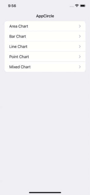
What Are We Going to Build Today?
We’ll create different charts. The finished version of our application will look like this:
You can access the source code of the final app here.
Description of The Project Structure
As you can imagine, we need a data for all the charts we will create. To meet this need, we created a struct named ChartData and created random data using separate computed property variables for each Mark type. You can find this struct under the Data folder.
Under the Models folder, you can find the models we created to manage the data, as you can imagine. These are: EnergyConsumption, HeartBeat, Person, Production and Sale.
Under the Modules folder, you will see the Charts we created as separate Views.
Line Chart
We often use the line chart to show data that changes over time and to be able to clearly display the change between them.
We used the line chart to show the number of sales made by a seller by day.
Code:
import SwiftUI
import Charts

// MARK: - View
struct LineChartView: View {

    // MARK: Properties
    private let chartData = ChartData.lineChartData

    // MARK: Body
    var body: some View {
        VStack {
            GroupBox("Sales Count Per Day") {
                Chart(chartData) { sale in
                    LineMark(
                        x: .value("Weekday", sale.date, unit: .hour),
                        y: .value("Count", sale.count)
                    )
                    .interpolationMethod(.cardinal)
                }
                .padding(.horizontal, 16)
            }
            .backgroundStyle(Color.white)
        }
        .navigationTitle("Line Chart")
    }
}

// MARK: - Preview
struct LineChartView_Previews: PreviewProvider {
    static var previews: some View {
        LineChartView()
    }
}
Output:
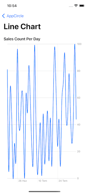
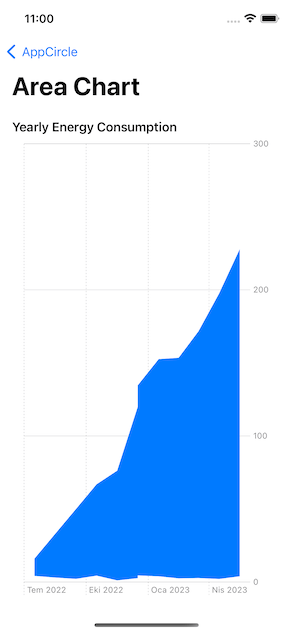
Area Chart
Area Chart basically represents the combined version of line chart and bar chart. Usually, we use it to show the cumulative sum of one or more numeric values based on a second variable.
In our project, we used the area chart to show the annual energy consumption increase.
Code:
import SwiftUI
import Charts

// MARK: - View
struct AreaChartView: View {
    // MARK: Properties
    private let chartData = ChartData.areaChartData

    // MARK: Body
    var body: some View {
        VStack {
            GroupBox("Yearly Energy Consumption") {
                Chart(chartData) { consumption in
                    AreaMark(
                        x: .value("", consumption.date, unit: .month),
                        yStart: .value("", consumption.monthlyMinMegawatt),
                        yEnd: .value("", consumption.monthlyMaxMegawatt)
                    )
                }
                .padding(.horizontal)
            }
            .backgroundStyle(Color.white)
        }
        .navigationTitle("Area Chart")
    }
}

// MARK: - Preview
struct AreaChartView_Previews: PreviewProvider {
    static var previews: some View {
        AreaChartView()
    }
}
Output:
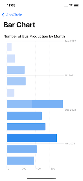
Bar Chart
Bar Chart is preferred for visualizing numeric values as bars divided into categories.
In our project, we visualized the bus production by month with the help of Bar Chart.
Code:
import SwiftUI
import Charts

// MARK: - View
struct BarChartView: View {
    // MARK: Properties
    private let chartData = ChartData.barChartData

    // MARK: Body
    var body: some View {
        VStack {
            GroupBox("Number of Bus Production by Month") {
                Chart(chartData) { production in
                    BarMark(
                        x: .value("Bus Production", production.count),
                        y: .value("Month", production.date, unit: .month)
                    )
                    .foregroundStyle(by: .value("Bus Production", production.count))
                }
                .padding(.horizontal, 16)
            }
            .backgroundStyle(Color.white)
        }
        .navigationTitle("Bar Chart")
    }
}

// MARK: - Preview
struct BarChartView_Previews: PreviewProvider {
    static var previews: some View {
        BarChartView()
    }
}
Output:
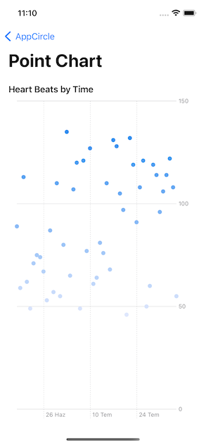
Point Chart
Another chart type we use to visualize time-varying values and data groups is Point Chart.
We used the Point Chart to visualize heart rate data, as Apple prefers in the Health app.
Code:
import SwiftUI
import Charts

// MARK: - View
struct PointChartView: View {

    // MARK: Properties
    private let chartData = ChartData.pointChartData

    // MARK: Body
    var body: some View {
        VStack {
            GroupBox("Heart Beats by Time") {
                Chart(chartData) { person in
                    PointMark(
                        x: .value("Time", person.heartBeat.time, unit: .minute),
                        y: .value("Heart Beat", person.heartBeat.beat)
                    )
                    .foregroundStyle(by: .value("Heart Beat", person.heartBeat.beat))
                }
                .padding(.horizontal, 16)
            }
            .backgroundStyle(Color.white)
        }
        .navigationTitle("Point Chart")
    }
}

// MARK: - Preview
struct PointChartView_Previews: PreviewProvider {
    static var previews: some View {
        PointChartView()
    }
}
Output:
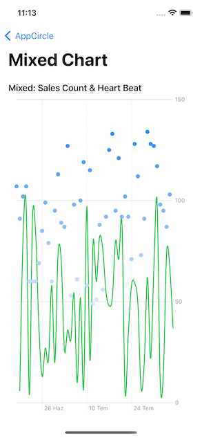
Bonus: Mixed Chart
As a bonus, we combined line chart and point chart data in one chart. Swift Charts gives us this convenience in every chart. You can also experiment with different types of graphic creation combinations yourself.
Code:
import SwiftUI
import Charts

// MARK: - View
struct MixedChartView: View {

    // MARK: Properties
    private let lineChartData = ChartData.lineChartData
    private let pointChartData = ChartData.pointChartData

    // MARK: Body
    var body: some View {
        VStack {
            GroupBox("Mixed: Sales Count & Heart Beat") {
                Chart {
                    ForEach(lineChartData) { sale in
                        LineMark(
                            x: .value("Weekday", sale.date, unit: .minute),
                            y: .value("Count", sale.count)
                        )
                        .interpolationMethod(.cardinal)
                    }
                    .foregroundStyle(.green)

                    ForEach(pointChartData) { person in
                        PointMark(
                            x: .value("Time", person.heartBeat.time, unit: .minute),
                            y: .value("Heart Beat", person.heartBeat.beat)
                        )
                        .foregroundStyle(by: .value("Heart Beat", person.heartBeat.beat))
                    }

                }
                .padding(.horizontal, 16)
            }
            .backgroundStyle(Color.white)
        }
        .navigationTitle("Mixed Chart")
    }
}

// MARK: - Preview
struct MixedChartView_Previews: PreviewProvider {
    static var previews: some View {
        MixedChartView()
    }
}
Output:
Properties
Now I’m going to show you briefly some of the Properties. You can make changes to your charts by using these properties.
X & Y Position
Actually, we have already used X and Y posts in our Marks. They exist to define our dataset to be located on the X and Y axes.
Foreground Style
We use Foreground Style for options such as coloring and grouping our data. You can see these two options in different Charts within the project. The MixedChart we created would be a good example of this.
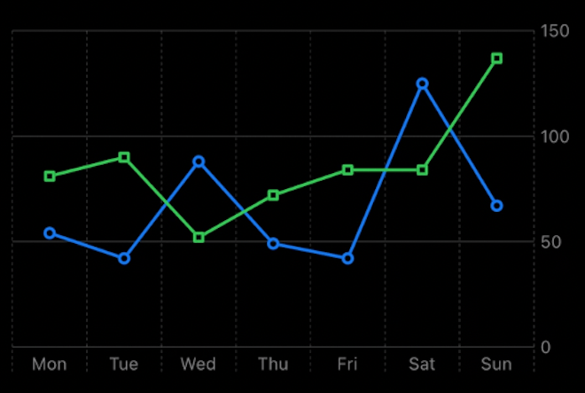
Symbol
As the name suggests, we can use Symbol to mark the intersecting points on the X and Y axes in our graphics with different symbols. Thus, you get a graphic that is easy to distinguish.
The chart below is an example of how we can diversify our chart with the Squareand Circle symbols. Moreover, the Charts library does this for us automatically.
Line Style
It is used to create new and custom plots for the Marks used in our chart. For example, to create bolder and rounded lines.
Conclusion
As you can see, using a few different modifiers, we can quickly create many different kinds of graphics without much effort.
Of course, these are not the only things we can do with Swift Charts. Apple has released many video series for us. You can learn how to create Charts in different structures by watching these videos.
Where to Go From Here?
Design an Effective Chart — WWDC22