Customizing the Switch Button in Android
Hi everyone! I love colors and use them in my apps to direct different emotions to the user. Customizing Switch Button in Android can be tricky. Let’s see how it’s done. First, we’ll look at the methods to change the colors. ✨ After that, we will use this button to change app theme.
Add SwitchCompat to XML
You can see default view below the code of added SwitchCompat view in XML file:
<?xml version="1.0" encoding="utf-8"?>
<androidx.constraintlayout.widget.ConstraintLayout
    xmlns:android="http://schemas.android.com/apk/res/android"
    xmlns:app="http://schemas.android.com/apk/res-auto"
    xmlns:tools="http://schemas.android.com/tools"
    android:layout_width="match_parent"
    android:layout_height="match_parent"
    tools:context=".MainActivity">

    <androidx.appcompat.widget.SwitchCompat
        android:id="@+id/switchButton"
        android:layout_width="wrap_content"
        android:layout_height="wrap_content"
        app:layout_constraintBottom_toBottomOf="parent"
        app:layout_constraintEnd_toEndOf="parent"
        app:layout_constraintHorizontal_bias="0.5"
        app:layout_constraintStart_toStartOf="parent"
        app:layout_constraintTop_toTopOf="parent"
        app:showText="false" />
</androidx.constraintlayout.widget.ConstraintLayout>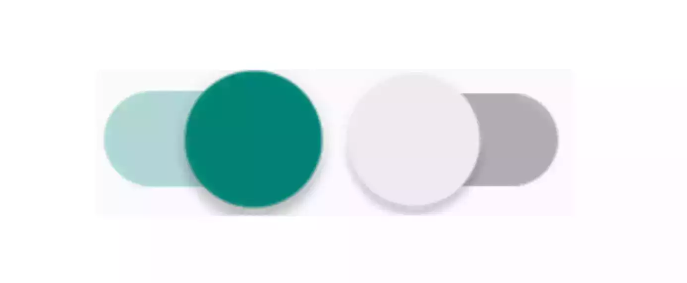
The switch button consists of 2 parts. These are Thumb and Track. We can customize each part with some attributes.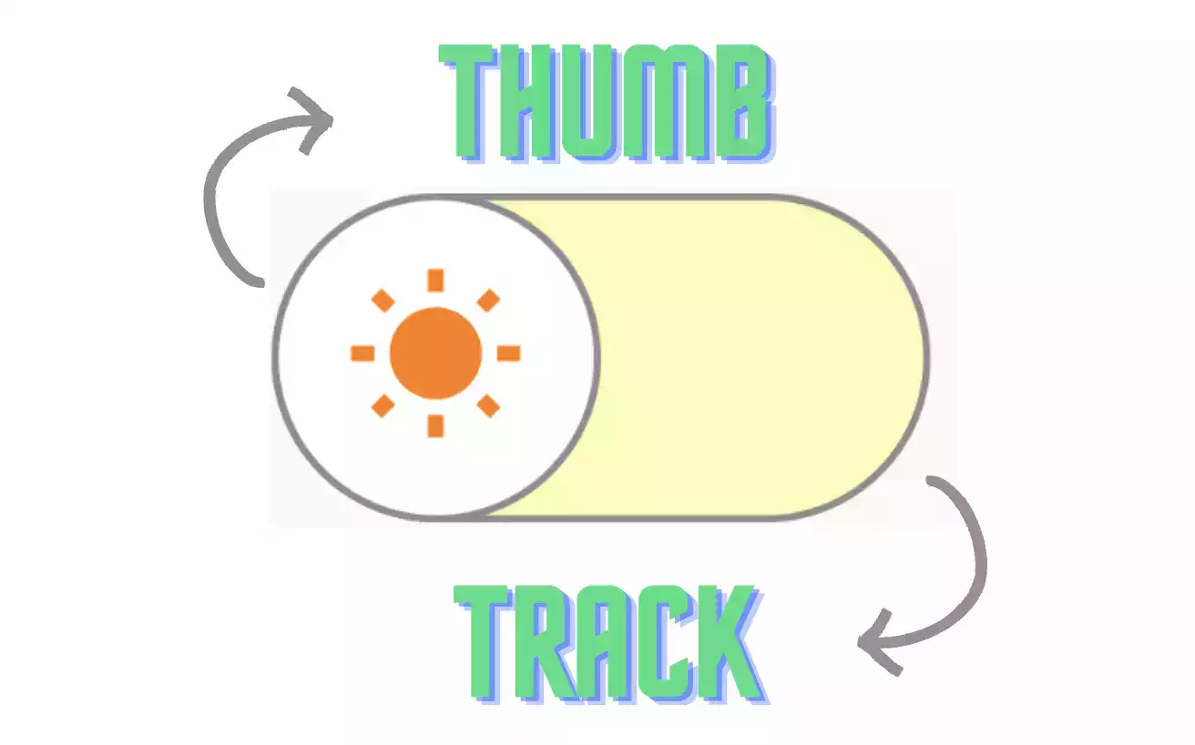
Final version of XML will be:
<?xml version="1.0" encoding="utf-8"?>
<androidx.constraintlayout.widget.ConstraintLayout
    xmlns:android="http://schemas.android.com/apk/res/android"
    xmlns:app="http://schemas.android.com/apk/res-auto"
    xmlns:tools="http://schemas.android.com/tools"
    android:layout_width="match_parent"
    android:layout_height="match_parent"
    tools:context=".MainActivity">

    <androidx.appcompat.widget.SwitchCompat
        android:id="@+id/switchButton"
        android:layout_width="wrap_content"
        android:layout_height="wrap_content"
        android:thumb="@drawable/thumb_layerlist"
        app:layout_constraintBottom_toBottomOf="parent"
        app:layout_constraintEnd_toEndOf="parent"
        app:layout_constraintHorizontal_bias="0.5"
        app:layout_constraintStart_toStartOf="parent"
        app:layout_constraintTop_toTopOf="parent"
        app:showText="false"
        app:track="@drawable/track_backgrounds" />

</androidx.constraintlayout.widget.ConstraintLayout>
We can create drawable files and add them for shaping track and thumb with app:track and android:thumb attributes.
Customize Track
We need to create new Drawable Resource File for track backgrounds in each state.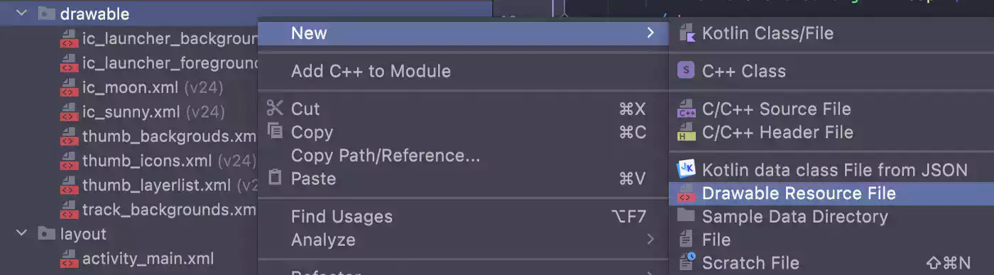
<?xml version="1.0" encoding="utf-8"?>
<selector xmlns:android="http://schemas.android.com/apk/res/android">

    <item android:state_checked="true">
        <shape android:shape="rectangle">
            <solid android:color="@color/blue_soft" />
            <corners android:radius="100dp" />
            <stroke android:width="2dp" android:color="@color/blue_moon" />
            <size android:height="20dp" />
        </shape>
    </item>

    <item android:state_checked="false">
        <shape android:shape="rectangle">
            <solid android:color="@color/yellow_soft" />
            <corners android:radius="100dp" />
            <stroke android:width="2dp" android:color="@color/gray" />
            <size android:height="20dp" />
        </shape>
    </item>

</selector>
Two different item created with same shape but different states and colors. All the dimension, color information to be added for this background can be defined here. After that we can use app:track and pass track_backgrounds.xml file.
Customize Thumb
If you want to add cute icons to thumb as mine ?, firstly we can create these icons with Vector Asset. You can select any icon and customize its color and size.
Our moon icon XML will be:
<vector xmlns:android="http://schemas.android.com/apk/res/android"
    android:width="56dp"
    android:height="56dp"
    android:tint="@color/blue_moon"
    android:viewportWidth="24"
    android:viewportHeight="24">

    <path
        android:fillColor="@android:color/white"
        android:pathData="M12.34,2.02C6.59,1.82 2,6.42 2,12c0,5.52 4.48,10 10,10c3.71,0 6.93,-2.02 8.66,-5.02C13.15,16.73 8.57,8.55 12.34,2.02z" />

</vector>
And our Sun Icon:
<vector xmlns:android="http://schemas.android.com/apk/res/android"
    android:width="56dp"
    android:height="56dp"
    android:tint="@color/orange_sun"
    android:viewportWidth="24"
    android:viewportHeight="24">

    <path
        android:fillColor="@android:color/white"
        android:pathData="M6.76,4.84l-1.8,-1.79 -1.41,1.41 1.79,1.79 1.42,-1.41zM4,10.5L1,10.5v2h3v-2zM13,0.55h-2L11,3.5h2L13,0.55zM20.45,4.46l-1.41,-1.41 -1.79,1.79 1.41,1.41 1.79,-1.79zM17.24,18.16l1.79,1.8 1.41,-1.41 -1.8,-1.79 -1.4,1.4zM20,10.5v2h3v-2h-3zM12,5.5c-3.31,0 -6,2.69 -6,6s2.69,6 6,6 6,-2.69 6,-6 -2.69,-6 -6,-6zM11,22.45h2L13,19.5h-2v2.95zM3.55,18.54l1.41,1.41 1.79,-1.8 -1.41,-1.41 -1.79,1.8z" />

</vector>
Now, we should define which icon will be shown in selected state and unselected state. Let’s create another drawable resource called thum_icons.xml like below.
<?xml version="1.0" encoding="utf-8"?>
<selector xmlns:android="http://schemas.android.com/apk/res/android">

    <item android:drawable="@drawable/ic_moon" android:state_checked="true" />
    <item android:drawable="@drawable/ic_sunny" android:state_checked="false" />

</selector>
But as you can see, there is also background layer in thumb under the icon. And this background layer can also change for each state. For example if check state is true, thumb’s stroke color is dark blue. But when check state is false, stroke color is gray. Background colors can also changeable but I chose to use white for both selection.
<?xml version="1.0" encoding="utf-8"?>
<selector xmlns:android="http://schemas.android.com/apk/res/android">

    <item android:state_checked="true">
        <shape android:shape="oval">
            <solid android:color="@color/white" />
            <stroke android:width="2dp" android:color="@color/blue_moon" />
            <size android:width="100dp" android:height="100dp" />
        </shape>
    </item>

    <item android:state_checked="false">
        <shape android:shape="oval">
            <solid android:color="@color/white" />
            <stroke android:width="2dp" android:color="@color/gray" />
            <size android:width="100dp" android:height="100dp" />
        </shape>
    </item>

</selector>
Drawable files have created for both layers. So how do we combine these files? Of course with layer-list!
<?xml version="1.0" encoding="utf-8"?>
<layer-list xmlns:android="http://schemas.android.com/apk/res/android">

    <item android:gravity="fill"
        android:drawable="@drawable/thumb_backgrouds" />

    <item android:gravity="center"
        android:drawable="@drawable/thumb_icons"
        android:top="20dp"
        android:bottom="20dp"
        android:left="20dp"
        android:right="20dp" />

</layer-list>
Finally, drawable file can pass with android:thumb attribute.
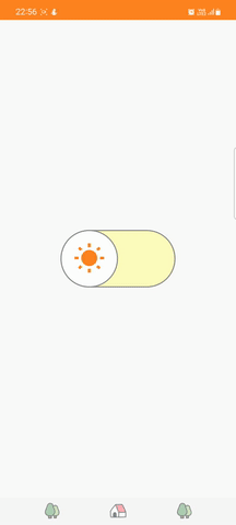
Switch Button in Android, Final Result
I used Shared Preferences to save the final state of the button in the MainActivity.kt file. So when the user reopen it, the app will be shown in the last selected theme.
package com.yagmurerdogan.customswitch

import android.content.SharedPreferences
import android.os.Bundle
import androidx.appcompat.app.AppCompatActivity
import androidx.appcompat.app.AppCompatDelegate
import com.yagmurerdogan.customswitch.databinding.ActivityMainBinding

class MainActivity : AppCompatActivity() {

    private lateinit var binding: ActivityMainBinding

    override fun onCreate(savedInstanceState: Bundle?) {
        super.onCreate(savedInstanceState)

        binding = ActivityMainBinding.inflate(layoutInflater)
        setContentView(binding.root)

        val sharedPreferences = getSharedPreferences(PREF_KEY, MODE_PRIVATE)
        val editor = sharedPreferences.edit()

        updateUI(sharedPreferences)

        binding.switchButton.setOnCheckedChangeListener { _, isChecked ->
            if (isChecked) {
                editor.putBoolean(SWITCH_BUTTON_KEY, true).apply()
                updateUI(sharedPreferences)
            } else {
                editor.putBoolean(SWITCH_BUTTON_KEY, false).apply()
                updateUI(sharedPreferences)
            }
        }
    }

    private fun updateUI(sharedPreferences: SharedPreferences) {
        binding.switchButton.apply {
            isChecked = sharedPreferences.getBoolean(SWITCH_BUTTON_KEY, false)
            if (isChecked) {
                AppCompatDelegate.setDefaultNightMode(AppCompatDelegate.MODE_NIGHT_YES)
            } else {
                AppCompatDelegate.setDefaultNightMode(AppCompatDelegate.MODE_NIGHT_NO)
            }
        }
    }

    companion object {
        const val SWITCH_BUTTON_KEY = "switch"
        const val PREF_KEY = "pref"
    }
}
And that’s it! Customizing Switch Button in Android may seem tricky, but it’s fairly easy once you know the tricks.
Sources
- You can access source code from Github.