
What’s New in UIKit at iOS 16, WWDC22
At WWDC 22, UIKit got a many improvements with iOS 16. These additions are new components, shortcuts for easier development, using SwiftUI in UIKit, self-sizing cells and more…
In this article, we will talk about these features added to UIKit with iOS 16 and provide code samples for each. Let’s start exploring…
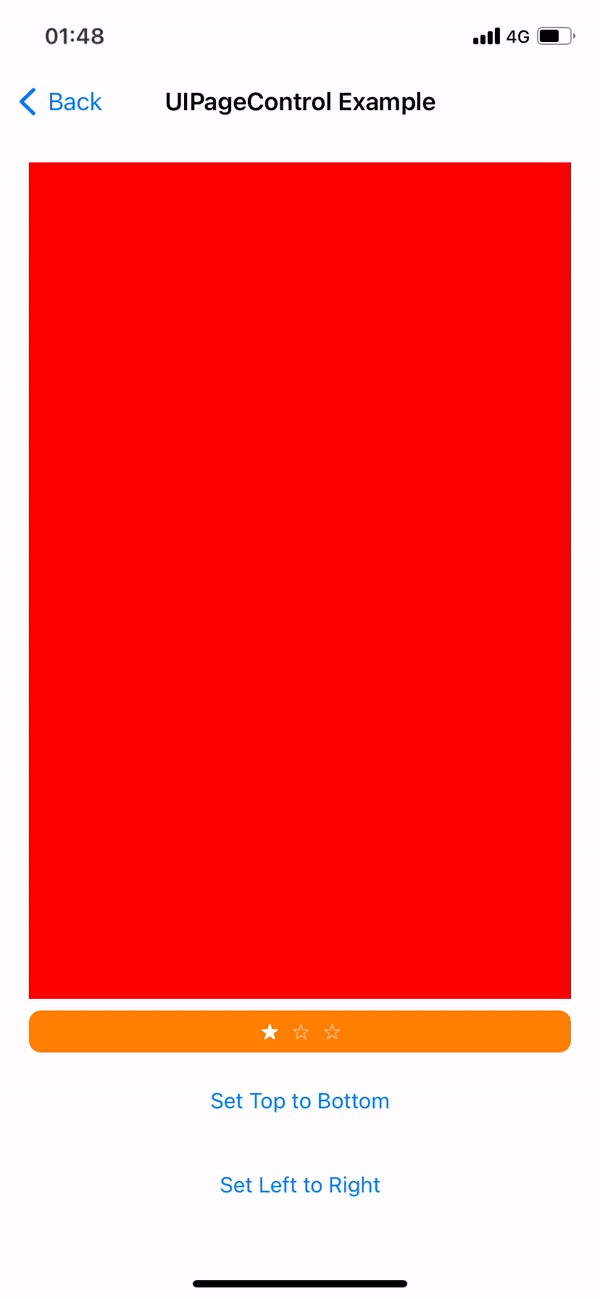
UIPageControl
Which we enjoy using and makes our work easier UIPageControl now can control layout direction as horizontal and vertical. In addition, custom image features have been added based on each state.
private lazy var pageControl: UIPageControl = {
    let pageControl = UIPageControl()
    pageControl.currentPage = .zero
    pageControl.numberOfPages = 3
    pageControl.direction = .leftToRight // In example we used also topToBottom
    pageControl.preferredIndicatorImage = UIImage(systemName: "star")
    pageControl.preferredCurrentPageIndicatorImage = UIImage(systemName: "star.fill")
    return pageControl
}()
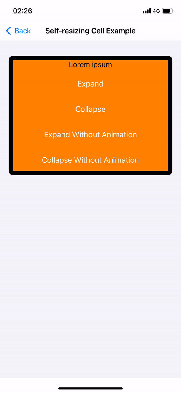
Self-resizing Cells
UICollectionView and UITableView now have self-resizing cells. The “selfSizingInvalidation” parameter is enabled by default. In our example we will perform it on the UICollectionView. This is because you need to use UICollectionLayoutListConfiguration and UICollectionViewCompositionalLayout as collectionViewLayout in UICollectionView. Also need to add the subviews inside the contentView in your cells. You can call self.invalidateIntrinsicContentSize() from inside the cell to trigger the resize operation manually.
private lazy var collectionView: UICollectionView = { [weak self] in
    var config = UICollectionLayoutListConfiguration(appearance: .insetGrouped)
    let layout = UICollectionViewCompositionalLayout.list(using: config)
    let collectionView = UICollectionView(
        frame: .zero,
        collectionViewLayout: layout
    )
    collectionView.translatesAutoresizingMaskIntoConstraints = false
    collectionView.dataSource = self
    collectionView.register(
        SelfResizingCollectionViewCell.self,
        forCellWithReuseIdentifier: SelfResizingCollectionViewCell.description()
    )

    //Enable by default
    collectionView.selfSizingInvalidation = .enabledIncludingConstraints
    return collectionView
}()
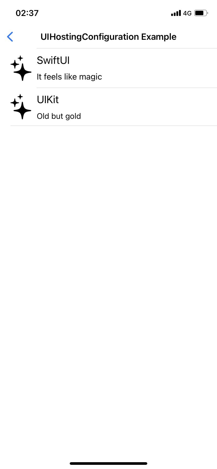
SwiftUI View In UITableView & UICollectionView (UIHostingConfiguration)
Now you can use your SwiftUI views with UIHostingConfiguration in UITableView and UICollectionView. The best part is that you can use the cells you have created with both UIKit and SwiftUI together.
extension UIHostingConfigurationExample: UITableViewDataSource {
    func tableView(_ tableView: UITableView, numberOfRowsInSection section: Int) -> Int {
        return contentDatas.count
    }

    func tableView(_ tableView: UITableView, cellForRowAt indexPath: IndexPath) -> UITableViewCell {
        let contentData = contentDatas[indexPath.row]
        let cell = indexPath.row == 0 ? createSwiftUICell(with: contentData) : createUIKitCell(with: contentData)
        return cell
    }
}

private extension UIHostingConfigurationExample {
    func createSwiftUICell(with contentData: ContentData) -> UITableViewCell {
        let cell = UITableViewCell()
        cell.contentConfiguration = UIHostingConfiguration {
            CustomSwiftUICell(contentData: contentData)
        }
        return cell
    }

    func createUIKitCell(with contentData: ContentData) -> UITableViewCell {
        let cell = CustomUIKitCell()
        cell.configure(with: contentData)
        return cell
    }
}
UIDevice Deprecations
// Synonym for model. Prior to iOS 16, user-assigned device name (e.g. @"My iPhone").
// In iOS 16 => iPhone 13 Pro Max
// Now it reports device name
UIDevice().name
//Now UIDevice().orientation now supported
//use preferredInterfaceOrientationForPresentation
UIDevice().orientation
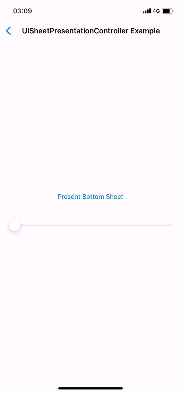
UIViewController().preferredInterfaceOrientationForPresentationCustomizing Sheets
Sheets entered our lives with iOS 15. Now receive detents in custom sizes with iOS 16 apart from the predefined detents. Calculated detents shouldn’t account safe area.
extension UISheetPresentationController.Detent.Identifier {
    static let developerDefiened = UISheetPresentationController.Detent.Identifier("developerDefiened")
}

final class UISheetPresentationControllerExample: UIViewController {

    private func presentBottomSheet() {
        let vc = SFSymbolsExample()
        vc.view.backgroundColor = .white
        guard let sheet = vc.sheetPresentationController else {
            return
        }

       //  sheet.largestUndimmedDetentIdentifier = .developerDefiened - You can add if clear background.

        sheet.detents = [
            .custom(identifier: .developerDefiened) { context in
                context.maximumDetentValue * self.multiplier
            }
        ]
        self.present(vc, animated: true)
    }
}
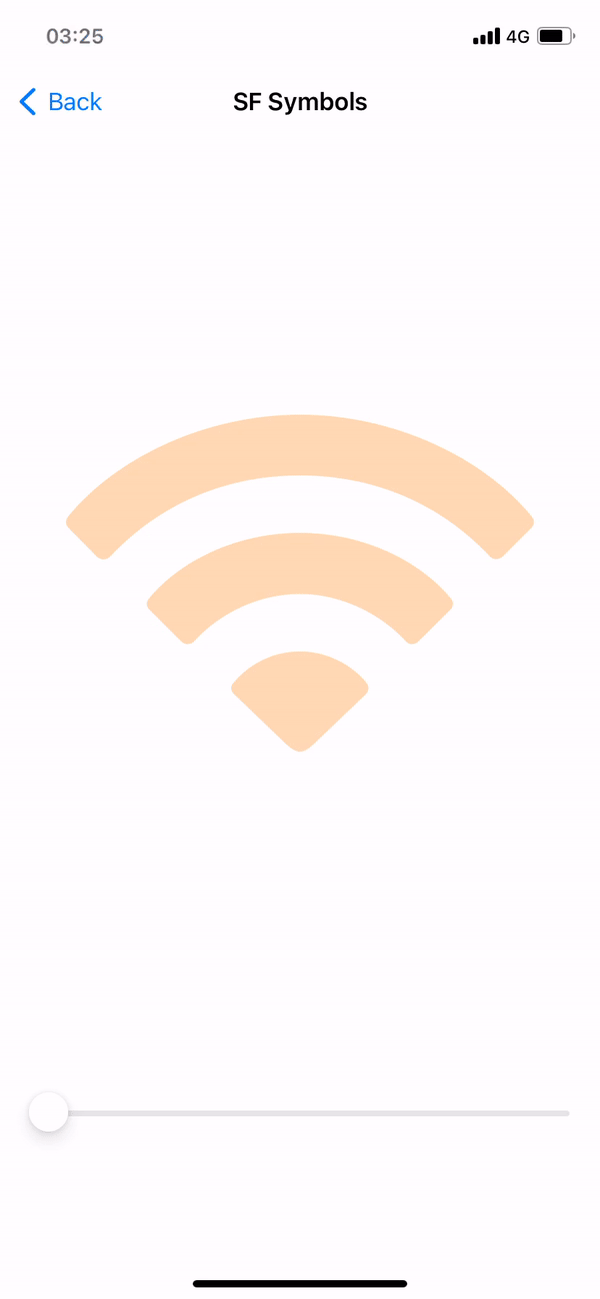
SF Symbols
In iOS 15 and earlier monochrome rendering was used by default but in iOS 16 hierarchical rendering is used. If you want to use monochrome in your application you can continue using monochrome by triggering UIImage.SymbolConfiguration.preferringMonochrome().
Also with iOS 16, Variable Symbols has entered our lives. Now we can create our symbols according to the value of the variable. You can even use with other rendering modes such as palette configuration.
@objc private func sliderDidValueChange(_ sender: UISlider) {
    imageView.image = UIImage(
        systemName: "wifi",
        variableValue: Double(sender.value),
        configuration: UIImage.SymbolConfiguration(paletteColors: [.orange])
    )
}
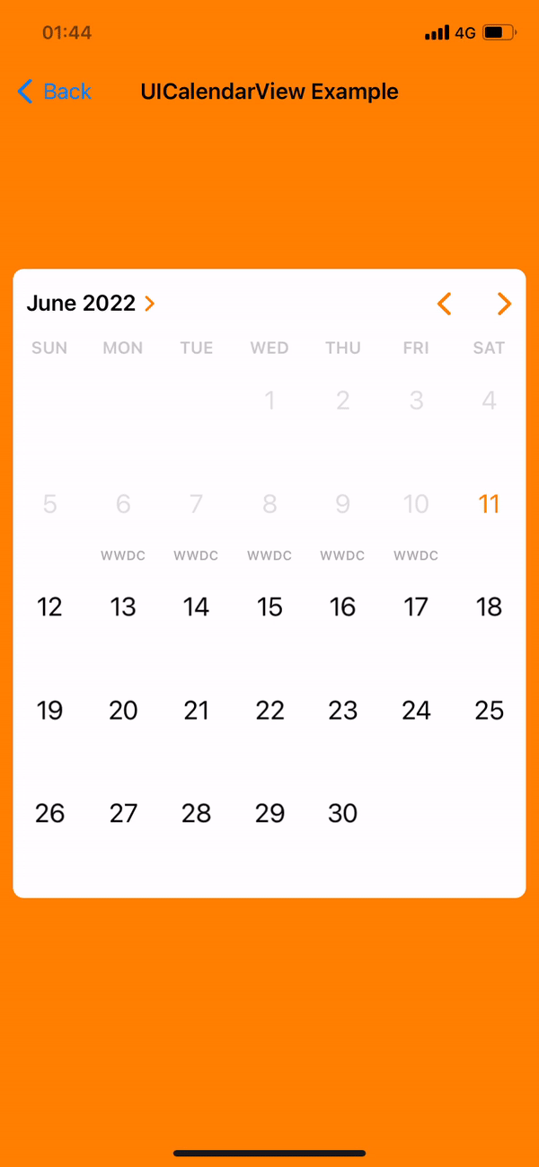
UICalendarView
When you need to use a calendar in your projects, you can now do it standalone with UICalendarView. The prominent features and the conveniences it provides to you are as follows:
- Different types of selection behaviors such as Single or Multiple selection
- Setting your desired dates as selectable or non-selectable
- To be able to give a custom view as well as various default decorations
- UICalendarView represent NSDateComponenets instead of NSDate and gives us more correct date value
Let’s take a look at the code side. UICalendarView has all the customizations you need. I have adjusted the configurations that need to be done while initializing as I want but the important thing to mention here is that the selectionBehaviordetermines whether the calendar will be multiselection or single selection. We need to add UICalendarSelectionMultiDateDelegate for multi selection, UICalendarSelectionSingleDateDelegate for single selection.
    private lazy var calendarView: UICalendarView = {
        let calendarView = UICalendarView()
        calendarView.calendar = Calendar(identifier: .gregorian)
        calendarView.timeZone = .autoupdatingCurrent
        calendarView.locale = .current
        calendarView.fontDesign = .default
        calendarView.delegate = self
        calendarView.visibleDateComponents = DateComponents(calendar: Calendar(identifier: .gregorian), year: 2022, month: 6, day: 1)

        // Set singleDateSelection if you want to set for Single Selection
        calendarView.selectionBehavior = multiDateSelection
        calendarView.selectionBehavior = singleDateSelection
        return calendarView
    }()

    private lazy var multiDateSelection: UICalendarSelectionMultiDate = {
        let multiDateSelection = UICalendarSelectionMultiDate(delegate: self)
        return multiDateSelection
    }()

    private lazy var singleDateSelection: UICalendarSelectionSingleDate = {
        let singleDateSelection = UICalendarSelectionSingleDate(delegate: self)
        return singleDateSelection
    }()
In our article, we will look at the part for multiselection, but you can examine the sample project in single selection. Our functions that come with UICalendarSelectionMultiDateDelegate allow us to select and determine whether the date of the presented DateComponents object is appropriate.
extension UICalendarViewExample: UICalendarSelectionMultiDateDelegate {
    func multiDateSelection(_ selection: UICalendarSelectionMultiDate, didDeselectDate dateComponents: DateComponents) {
        selectedDates.removeAll(where: { dateComponents == $0 })
    }

    func multiDateSelection(_ selection: UICalendarSelectionMultiDate, didSelectDate dateComponents: DateComponents) {
        selectedDates.append(dateComponents)
    }

    func multiDateSelection(_ selection: UICalendarSelectionMultiDate, canSelectDate dateComponents: DateComponents) -> Bool {
        dateComponents.isDatePassed()
    }

    func multiDateSelection(_ selection: UICalendarSelectionMultiDate, canDeselectDate dateComponents: DateComponents) -> Bool {
        dateComponents.isDatePassed()
    }
}
The feature that I personally like the most, which allows us to customize our calendars decorators. At this point, we need to add the UICalendarViewDelegate protocol to our Controller so that we can use the decorators. Afterwards, it allows us to use the default decorators in UIKit as well as add custom decorators.
extension UICalendarViewExample: UICalendarViewDelegate {
    func calendarView(_ calendarView: UICalendarView, decorationFor dateComponents: DateComponents) -> UICalendarView.Decoration? {
        guard let event = eventDays.filter({ $0.dateComponents.isSameDate(with: dateComponents) }).first else {
            return nil
        }

        switch event.decorationType {
        case .none:
            return nil
        case .defaultDecorator:
            return .default(color: .purple, size: .large)
        case .image:
            return .image(.init(systemName: "applelogo"), color: .red)
        case .customView:
            return .customView {
                let label = UILabel()
                label.text = "WWDC"
                label.textColor = event.titleColor
                label.font = .boldSystemFont(ofSize: 10)
                return label
            }
        }
    }
}
That’s it for now with UICalendarView. Tt’s time to review other innovations. You can get more detailed information about its use from the sample project link at the end of our article.
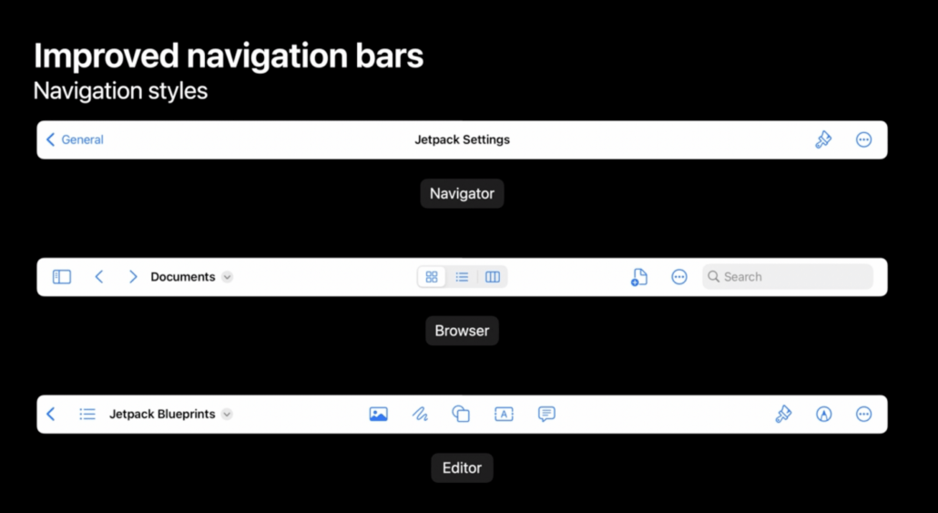
Improved Navigation Bars
Now, with iOS 16, two different navigation styles have entered our lives, these are Browser and Editor. It enables us to make our browser-based applications more user-friendly with the Editor style interface and document based and Browser style. Center items instead of TitleView allow us to offer more options to our users, and when there are application windows side by side, they automatically move items that do not fit on the screen into the overflow menu. Additionally Mac Catalyst take advantage improve navigation Bar without code required.
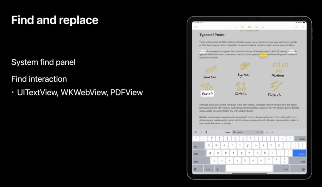
Find And Replace
Another innovation that comes with iOS 16 is Find and replace. It’s designed to work on text, unlike higher-level in-app searches. It can be activated with only one flag for UIKit views such as UITextView and WKWebView.
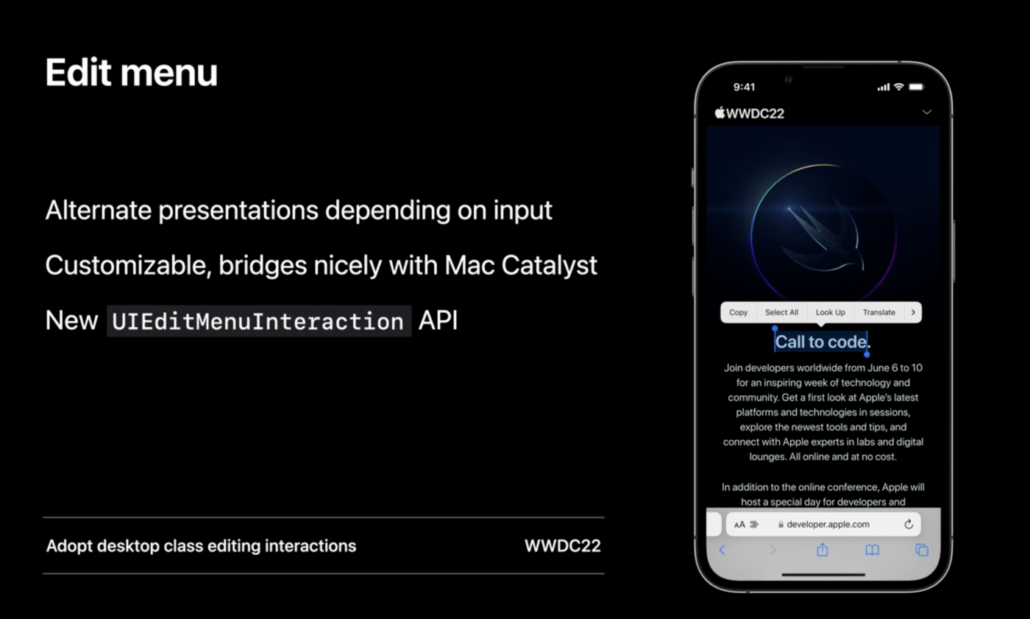
Edit Menu
Now in iOS 16 edit menu has mature update. On touch intereaction you have new reddesign menu which is more interactive. Also we have more full featured context menu for pointers. To provide this new features you can use with UIEditMenuInteraction API as a full replacment of UIMenuController (Deprecated).
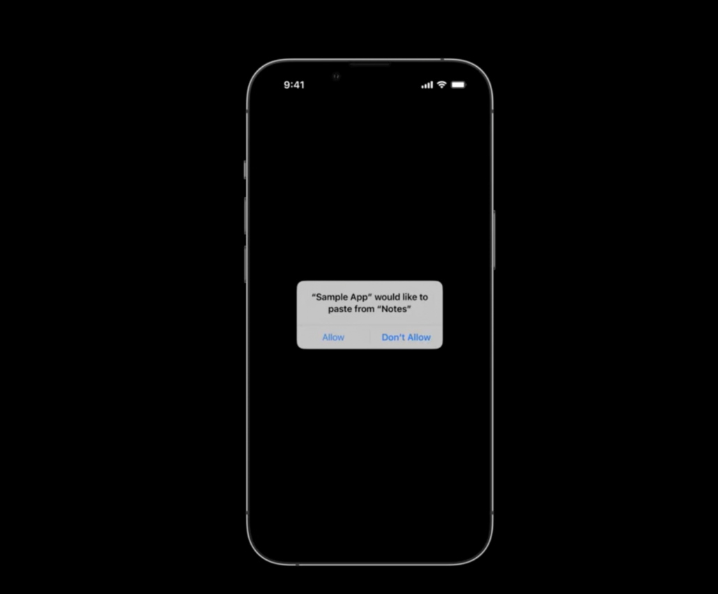
UIPasteControl
Before iOS 16 in copy-paste operations has banner displayed to user now it’s replaced by an alert. This permission alert is automatically prompted by the system and you can access the content according to the answer. If CustomPasteControl exists you need to replace them with UIPasteControl.
That’s all for now what Apple has brought for UIKit with iOS 16 at WWDC. To have more ideas about the incoming innovations, you can check our sample project from the link below. Stay tuned.

