Developing with Live Activities API in iOS 16
In #WWDC22, Apple announced so many new improvements and features from Xcode, Swift, SwiftUI and many more. There were some updates which took my attention directly on them with the power of helping users more and make their life easier than ever. One of those features is Live Activities API in iOS 16.
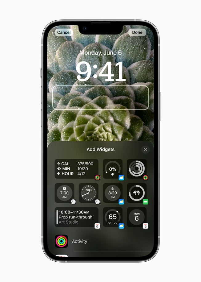
First things first: Lock Screen Widgets!
Starting from iOS 16, users will be able to customize their lock screens. There will be new faces like we have in Apple Watch for a long time. Also we will be able to develop new widgets for lock screen to create small and sharp beneficial stuff for our users.
Live Activities API in iOS 16
I really like “Live Activities”. Because instead of pushing users with tons of push notifications, we will be able to show them the real status for continues processes.
Apple says:
“Live Activities is a new feature that helps users stay on top of things that are happening in real time, such as a sports game, workout, ride-share, or food delivery order, right from the Lock Screen.”
As developers, we can create this new cool feature for;
- Food Delivery Process
- Online Match Results
- Music/Stream previews
- Status of any ongoing process that takes longer than 30 seconds
With Live Activities, you can expand Now Playing controls to a full-screen view that celebrates album art while you listen along.
We will be able to use Live Activities with App Clips, too.
How to use Live Activities API in iOS 16?
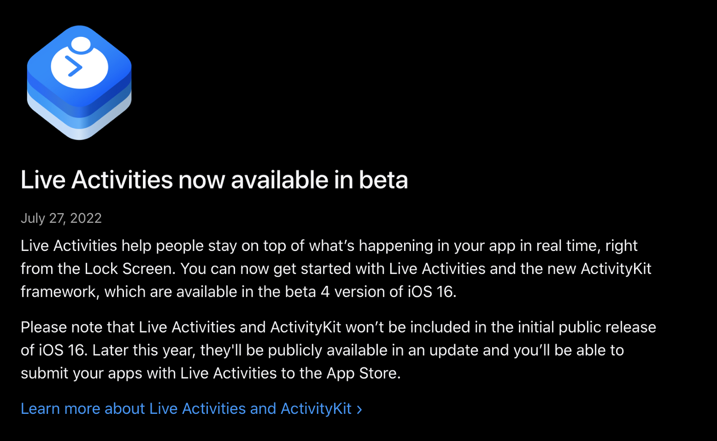
Apple released Live Activities API as beta on July 28th, 2022. Let’s look at how we can use this API and display Live Notifications, right on the iOS 16 Lock Screen.
We’ll develop an app that displays the status of our builds that are currently running at our CI/CD platform. I will put whole project link at github at the end of the article.
Prerequisites
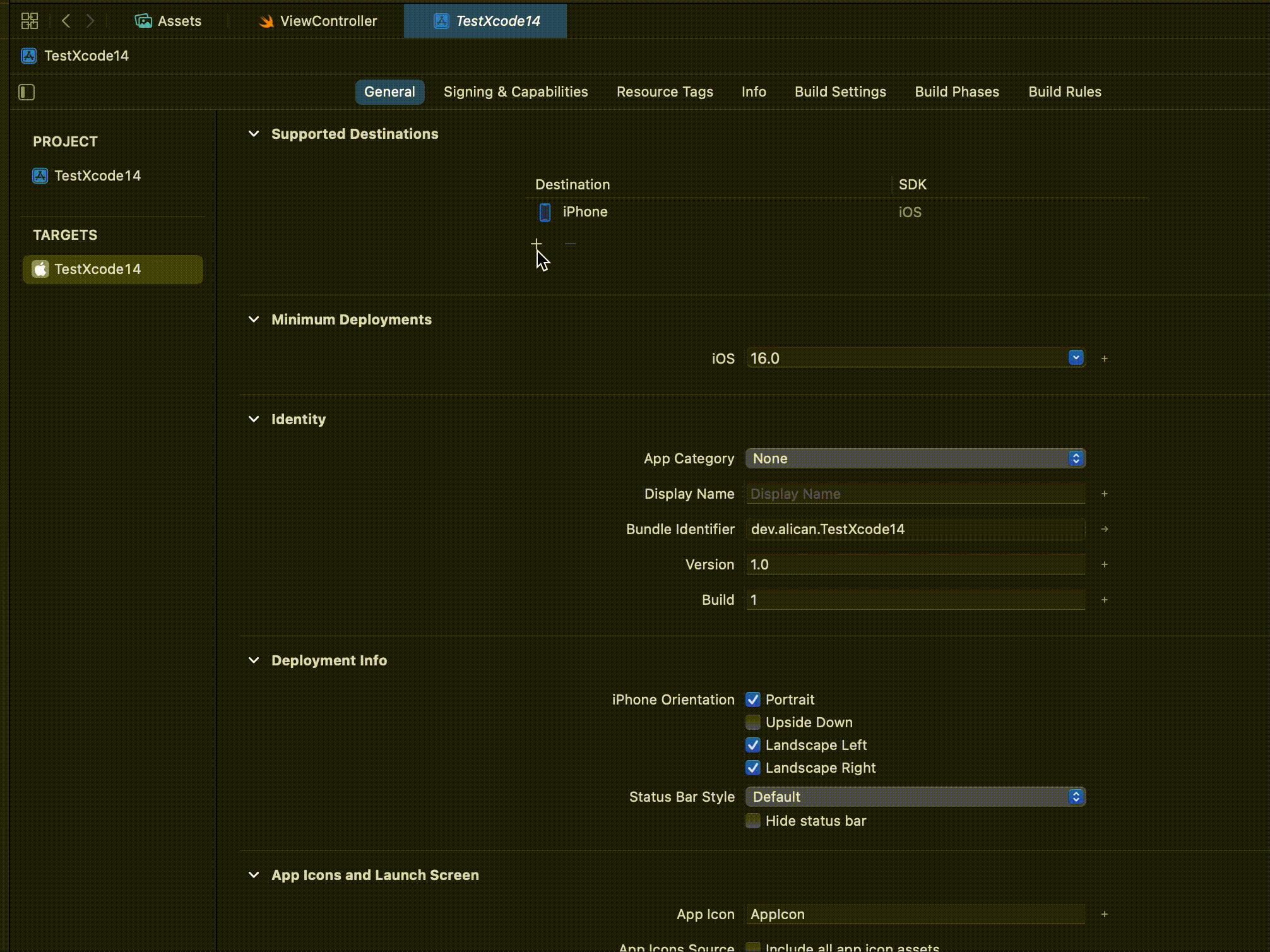
- Xcode 14 beta 4: Download Xcode 14 beta (6.97 GB)
- Beta 4 of iOS 16
Let’s create an app
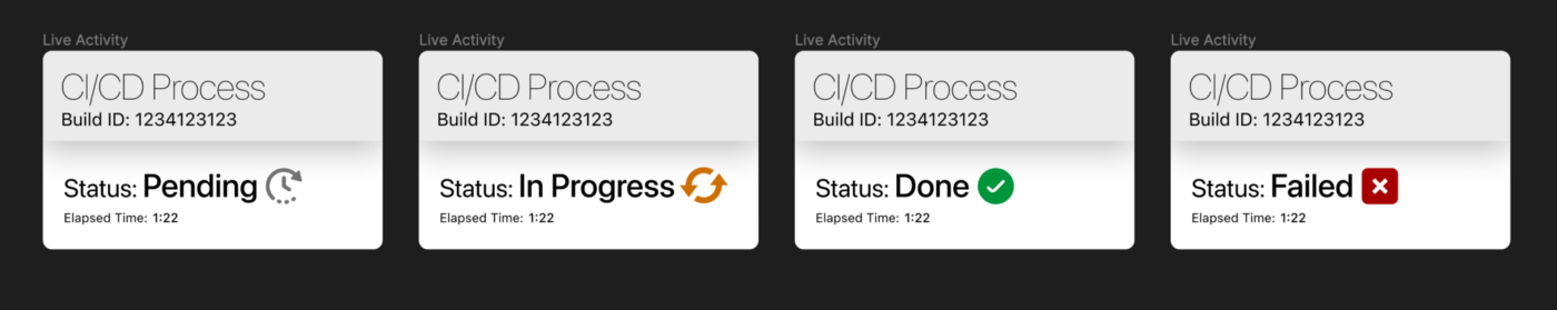
I prepared this process for you starting with figma. I designed a new view for the Live Activity that we will use. Example project will be about the CI CD pipelines that we have on AppCircle. Appcircle is an easy-to-setup mobile CI/CD platform with testing and store deployment which I like most. So, instead of doing same food delivery application, having another perspective for this feature will be better, I think.
Think about the processes of ours on the AppCircle. When a state of a pipeline was changed, we want to let user know about it with giving build id.
You can check the design freely here. And a sneak peak from the design which is about the states that we will display.
Step 1:
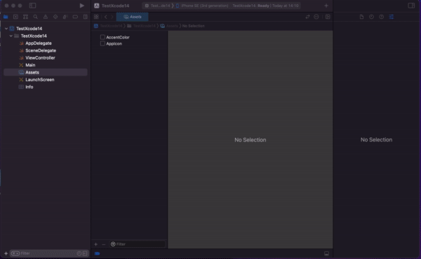
Create a new project with SwiftUI.
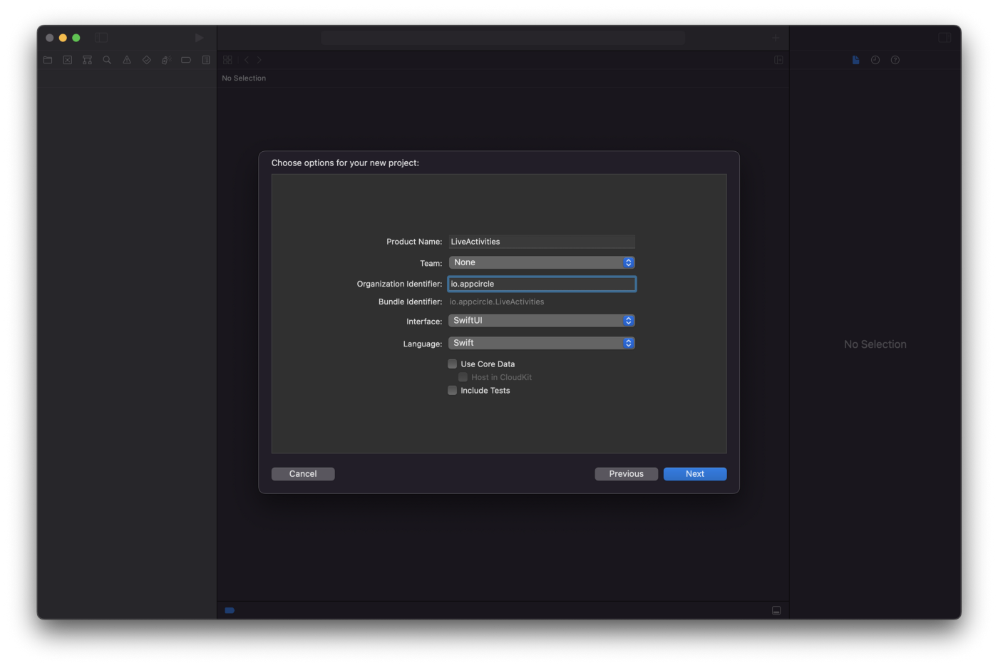
Create a new Xcode Project
Step 2:
Add a new widget extension into your project.
– As I mentioned above, we will also use widget to display the ui.
File -> New -> Target -> Widget Extension and give it a name.
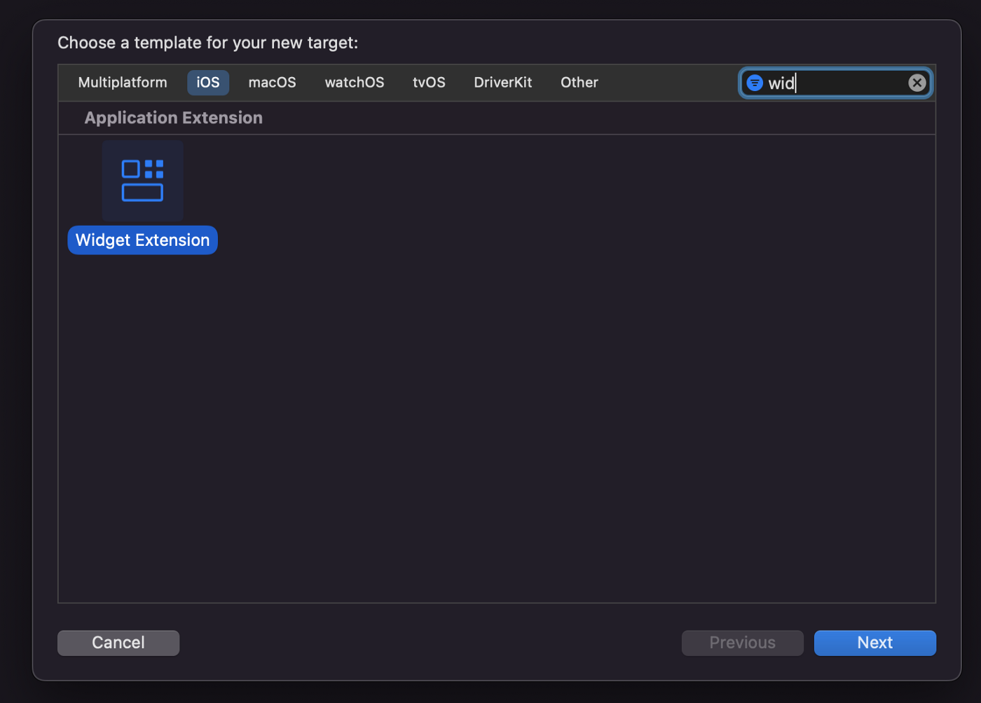
Add a new Widget Extension target
Step 3:
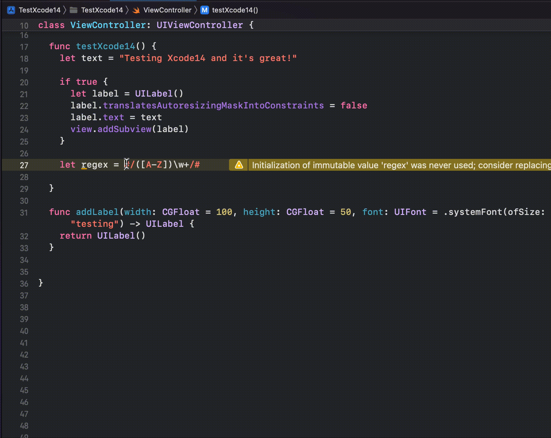
Add NSSupportsLiveActivities as Boolean with the value as YES in your Info.plist file.
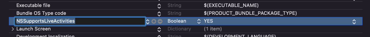
NSSupportsLiveActivities
Step 4:
I prefer to start building the UI first. So create your UI at your WidgetExtension (The one when Xcode adds by default right after adding Widget Extension). You can find the file structure below.
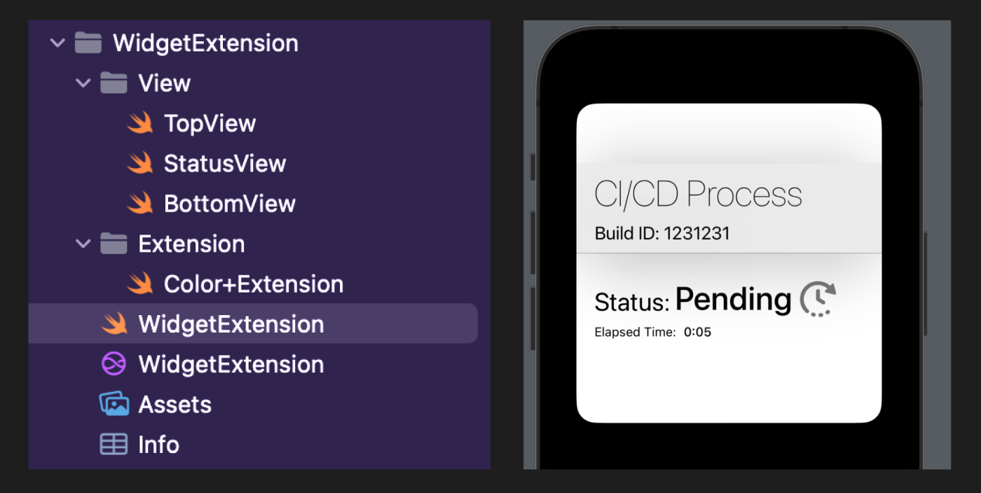
Widget Extension File Structure
// BottomView.swift
// LiveActivity
//
// Created by Ali Can Batur on 29.07.2022.

import SwiftUI

struct BottomView: View {
    @State var state: StatusAttribute.ContentState

    var body: some View {
        VStack {
            HStack(spacing: 0) {
                Text("Status:")
                    .font(.system(size: 28, weight: .regular))
                    .padding(.top, 36)
                Text(state.status.title)
                    .font(.system(size: 36, weight: .medium))
                    .padding(.top, 28)
                    .padding(.leading, 5)
                Image(state.status.icon)
                    .frame(width: 40, height: 40)
                    .padding(.top, 30)
                    .padding(.leading, 8)
            }
            .frame(maxWidth: .infinity, alignment: .leading)
            .padding(.horizontal, 20)

            HStack(spacing: 8) {
                if state.status.isDone {
                    Text("Process finished.")
                        .font(.system(size: 14, weight: .regular))
                } else {
                    Text("Elapsed Time:")
                        .font(.system(size: 14, weight: .regular))
                    Text(state.estimatedCompletionTime, style: .timer)
                        .font(.system(size: 14, weight: .medium))
                }
            }
            .frame(maxWidth: .infinity, alignment: .leading)
            .padding(.horizontal, 20)
            .padding(.bottom, 26)
        }
    }
}

// StatusView.swift
// LiveActivity
//
// Created by Ali Can Batur on 29.07.2022.

import SwiftUI

struct StatusView: View {
    @State var attribute: StatusAttribute
    @State var state: StatusAttribute.ContentState

    var body: some View {
        ZStack {
            Color.white
            VStack(spacing: 0) {
                TopView(attribute: attribute)
                BottomView(state: state)
            }
            .activitySystemActionForegroundColor(Color.cyan)
        }
    }
}

// TopView.swift
// LiveActivity
//
// Created by Ali Can Batur on 29.07.2022.

import SwiftUI

struct TopView: View {
    @State var attribute: StatusAttribute

    var body: some View {
        ZStack {
            Color(hex: "EBEBEB")
            VStack(alignment: .leading, spacing: 8) {
                Text("CI/CD Process")
                    .font(.system(size: 40, weight: .ultraLight))
                Text("Build ID: \(attribute.buildId)")
                    .font(.system(size: 20, weight: .regular))
            }
            .frame(maxWidth: .infinity, maxHeight: .infinity, alignment: .leading)
            .padding(.horizontal, 20)
        }
        .frame(maxWidth: .infinity, alignment: .leading)
        .frame(height: 99)
        .shadow(color: .black.opacity(0.25), radius: 40, x: 0, y: 10)
        Rectangle()
            .fill(Color.gray.opacity(0.5))
            .frame(height: 1)
    }
}

// WidgetExtension.swift
// WidgetExtension
//
// Created by Ali Can Batur on 28.07.2022.

import WidgetKit
import SwiftUI
import Intents

@main
struct WidgetExtension: Widget {
    let kind: String = "WidgetExtension"

    var body: some WidgetConfiguration {
        ActivityConfiguration(attributesType: StatusAttribute.self) { context in
            StatusView(attribute: context.attributes, state: context.state)
        }
    }
}

struct WidgetExtension_Previews: PreviewProvider {
    static var previews: some View {
        let testAttribute = StatusAttribute(buildId: "1231231")
        let testState = StatusAttribute.ContentState(
            status: .pending,
            estimatedCompletionTime: Date()
        )
        StatusView(attribute: testAttribute, state: testState)
            .previewContext(WidgetPreviewContext(family: .systemLarge))
    }
}
Step 5:
Now we have the UI for the WidgetExtension. Let’s focus on the core part.
First I want to create an enum for the statuses that we will use. In the Live Activity, I will use this statuses to show user the latest status of our CI/CD pipeline.
// Status.swift
// LiveActivity
//
// Created by Ali Can Batur on 29.07.2022.

import Foundation

enum Status: Codable {
    case pending
    case inProgress
    case succeed
    case failed

    var isDone: Bool {
        return self == .failed || self == .succeed
    }

    var title: String {
        switch self {
        case .pending:
            return "Pending"
        case .inProgress:
            return "In Progress"
        case .succeed:
            return "Succeed"
        case .failed:
            return "Failed"
        }
    }

    var icon: String {
        switch self {
        case .pending:
            return "pending"
        case .inProgress:
            return "in-progress"
        case .succeed:
            return "succeed"
        case .failed:
            return "failed"
        }
    }
}
Next, I will create the most important file. In this file, notice the ActivityAttributes. We will start, update or end our Activity using this file. You can take it as Payload for the running state of the app.
For our example, I need buildId for the activity and it is not the data that will be updated continuously. For the part that we will update, we will use ContentState part. The data of ContentState will be the one which is being updated. We can use Remote Push Notifications using that part. I will give you an example later on this article.
// Attribute.swift
// LiveActivity
//
// Created by Ali Can Batur on 28.07.2022.

import SwiftUI
import WidgetKit
import ActivityKit

struct StatusAttribute: ActivityAttributes {

    public typealias ProcessStatus = ContentState

    public struct ContentState: Codable, Hashable {
        var status: Status
        var estimatedCompletionTime: Date
    }

    var buildId: String
}
I created another helper class to manage this process programatically. I will tell you about it step by step.
// LiveActivityHelper.swift
// LiveActivity
//
// Created by Ali Can Batur on 29.07.2022.

import Foundation
import ActivityKit

class LiveActivityHelper {

    var statusActivity: Activity<StatusAttribute>?

    func start() {
        // We can check if activity is enabled.
        guard ActivityAuthorizationInfo().areActivitiesEnabled else {
            print("Activities are not enabled!")
            return
        }

        // Initializing the models.
        let statusAttribute = StatusAttribute(buildId: "123456789")
        let initialStatus = StatusAttribute.ProcessStatus(status: .pending, estimatedCompletionTime: Date().addingTimeInterval(60))

        // Key point here!
        // Now we tell iOS that there is a new activity started!
        do {
            statusActivity = try Activity<StatusAttribute>.request(
                attributes: statusAttribute,
                contentState: initialStatus,
                pushType: nil
            )
            guard let statusActivity else {
                print("Error: Could not initialize activity.")
                return
            }
            print("Build with ID: \(statusActivity.id) is now pending.")
        } catch {
            print("Error: \(error.localizedDescription)")
        }
    }

    // Now I will update the current activity.
    func update() {
        Task {
            let updatedCICDStatus = StatusAttribute.ProcessStatus(status: .inProgress, estimatedCompletionTime: Date().addingTimeInterval(30))
            guard let statusActivity else { return }
            await statusActivity.update(using: updatedCICDStatus)
        }
    }

    func end(with status: Status) {
        Task {
            let updatedCICDStatus = StatusAttribute.ProcessStatus(status: status, estimatedCompletionTime: Date())
            guard let statusActivity else { return }
            await statusActivity.end(using: updatedCICDStatus, dismissalPolicy: .default)
        }
    }
}
var statusActivity: Activity<StatusAttribute>?
This creates an activity. This instance is the main data which is our activity that we display on lock screen.
<span style="color: #993366;">guard ActivityAuthorizationInfo().areActivitiesEnabled else {
print("Activities are not enabled!")
return
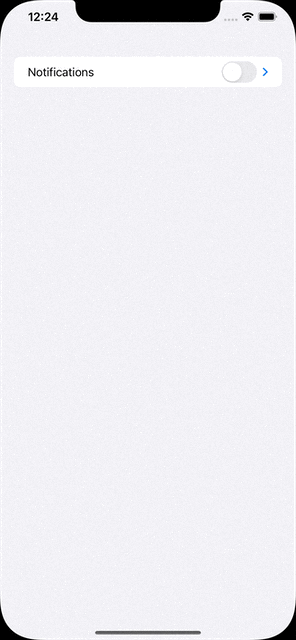
}</span>We can check if LiveActivities are enabled.
For the above one, I should tell you that users can disable Live Activities from Settings.
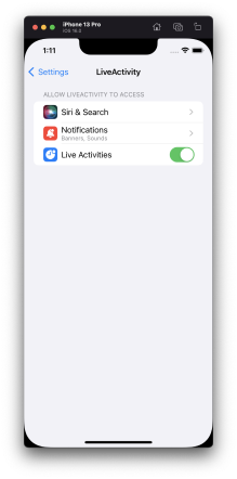
Live Activities in iOS Settings
let statusAttribute = StatusAttribute(buildId: "123456789")
let initialStatus = StatusAttribute.ProcessStatus(status: .pending, estimatedCompletionTime: Date().addingTimeInterval(60))

do {
    statusActivity = try Activity<StatusAttribute>.request(
        attributes: statusAttribute,
        contentState: initialStatus,
        pushType: nil
    )
    guard let statusActivity else {
        print("Error: Could not initialize activity.")
        return
    }
    print("Build with ID: \(statusActivity.id) is now pending.")
} catch {
    print("Error: \(error.localizedDescription)")
}
We create data for our activity here. When you set statusActivity the activity will start on your Lock Screen.
Update function will create a new instance for the status and when we call
await statusActivity.update(using: updatedCICDStatus) the activity data will be updated with the one that we send.
End function ends the activity. Hitting await statusActivity.end(using: updatedCICDStatus, dismissalPolicy: .default) will do the trick for you here. DismissalPolicy describes how and when to dismiss the UI associated with the live activity and I preferred .default. You can make it dismiss immediate or after a delay, too.
Step 6:
Do you want to see it in action? This is the time my friends.
I will create a dummy screen for my app with 4 buttons. Button 1 will start this process, Button 2 will update the data, Button 3 will end process with success and Button 4 will end with failure. Ending an activity has no success of failure states, in our example, our own CICD process will end with a state of the CI process, so please notice the difference here.
// ContentView.swift
// LiveActivity
//
// Created by Ali Can Batur on 28.07.2022.

import SwiftUI
import ActivityKit

struct ContentView: View {

    let helper: LiveActivityHelper = LiveActivityHelper()

    var body: some View {
        VStack(spacing: 16) {

            Button {
                DispatchQueue.main.asyncAfter(deadline: .now() + 2) {
                    helper.start()
                }
            } label: {
                Text("Start")
                    .font(.system(size: 18, weight: .medium))
            }

            Button {
                DispatchQueue.main.asyncAfter(deadline: .now() + 2) {
                    helper.update()
                }
            } label: {
                Text("Update with in progress")
                    .font(.system(size: 18, weight: .medium))
            }

            Button {
                DispatchQueue.main.asyncAfter(deadline: .now() + 2) {
                    helper.end(with: .succeed)
                }
            } label: {
                Text("End with succeed")
                    .font(.system(size: 18, weight: .medium))
            }

            Button {
                DispatchQueue.main.asyncAfter(deadline: .now() + 2) {
                    helper.end(with: .failed)
                }
            } label: {
                Text("End with failed")
                    .font(.system(size: 18, weight: .medium))
            }

        }
    }
}

struct ContentView_Previews: PreviewProvider {
    static var previews: some View {
        ContentView()
    }
}
I put asyncAfter in the calls. The reason is to see the updated status of my Live Activity properly because if I make those changes immediately, I won’t be able to see the animation of the updated status. That’s here only to show you its working properly.
So, let’s watch it.
Remote Push Notifications
We can update our activity in 2 ways. One of them is doing programmatically while our app is alive and the other way is to do it via Remote Push Notifications.
Step 1:
If you’re new to remote push notifications, review the documentation for the User Notifications framework. Make sure you read Registering Your App with APNs and Asking Permission to Use Notifications, and plan time to implement your remote notification server as described in the user notification documentation.
- We do not have to register for remote push notifications with registerForRemoteNotifications() for our Live Activity. Instead, use ActivityKit to get a push token.
- We cannot start an activity using push notifications (I may be wrong but Apple says we can update or end an activity using push notifications.)
- We need to have an APNS flow to use this. To see more:
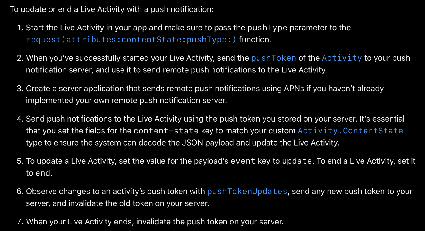
- When we have proper push notification flow, all we need to do is adding a custom json object in the push notification payload like below.
{
    "aps": {
        "timestamp": 1650998941,
        "event": "end", // OR it can be update
        "content-state": {
            "status": "succeed",
            "estimatedCompletionTime": 1659416400
        }
    }
}
Technical Notes
- Live Activities and ActivityKit won’t be included in the initial publicly released version of iOS 16 but will be publicly available in an update later this year. Once they’re publicly available, you can submit your apps with Live Activities to the App Store.
- Live Activities are only available on iPhone.
- You will need a widget extension to use this feature. But, consider offering both a widget and Live Activities to allow people to add glanceable information and a personal touch to their Home Screen and Lock Screen.
- Live Activities use SwiftUI for their user interface on the Lock Screen.
- You can have a Live Activity active for up to 8 hours unless your app or the user explicitly ends it. After 8 hours the system automatically ends a Live Activity. In this ended state, the Live Activity remains on the Lock Screen for up to 4 additional hours before the system removes it. The user can also choose to remove it. As a result, a Live Activity remains on the Lock Screen for a maximum of 12 hours.
- You cannot access network or location updates in Live Activities. We use WidgetKit to make this feature run but unfortunately they aren’t widgets. So, to update a Live Activity you can use ActivityKit while the app is running or Remote Push Notifications.
- You can update data of a Live Activity using ActivityKit or Remote Push Notifications. The size of the updated dynamic data can’t exceed 4KB, both for ActivityKit and Remote Pushes.
- ActivityKit’s role is to handle the life cycle of each Live Activity: You use its API to request, update, and end a Live Activity.
- The system may truncate a Live Activity UI if its height exceeds 220 pixels.
- A device can run Live Activities from multiple apps and each app can run multiple Live Activities. So We need to handle any errors while running, starting or ending a Live Activity. Because device can reach to LA limits.
https://www.apple.com/ios/ios-16-preview/features/
https://www.apple.com/newsroom/2022/06/apple-unveils-new-ways-to-share-and-communicate-in-ios-16/