
What is New in SwiftUI 4.0, WWDC 2022
WWDC 22 is passed so quick, isn’t it? SwiftUI is one of the most awaited subjects from developers in WWDC 22. Some of the developers are satisfied with the new features for SwiftUI, but some are not.
Here are the features that will be in SwiftUI 4.0, iOS 16.
Hide Home Button(Indicator)
Some screens are required a lot of taps and focus from the user. To achieve this goal, we can hide the bottom native indicator in SwiftUI not.
var body: some View {
    EmptyView()
        .persistentSystemOverlays(.hidden)
}
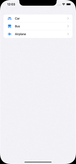
Navigation Stack
The new way to manage navigations instead of NavigationView.
With the new NavigationStack, we can define multiple destinations by the model.
let vehicles: [Vehicle] = [
    .init(name: "Car", iconName: "car"),
    .init(name: "Bus", iconName: "bus"),
    .init(name: "Airplane", iconName: "airplane")
]

var body: some View {
    NavigationStack {
        List(vehicles) { vehicle in
            NavigationLink(value: vehicle) {
                Label(vehicle.name, systemImage: vehicle.iconName)
            }
        }
        .navigationDestination(for: Vehicle.self) { vehicle in
            VehicleDetailView(vehicle: vehicle)
        }
    }
}
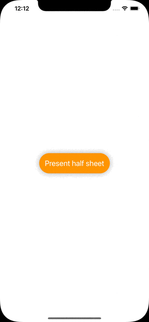
Half Sheet
It is one of the features developers mostly demand. Finally, Apple is making it public for us!
All we need to do is call the presentationDetents function of the view we will show as the half sheet.
The function takes detents as the parameter to set the height of the sheet. We can also set a constant height by typing .height(200).
@State var isPresentedHalfSheet: Bool = false

var body: some View {
    Button {
        self.isPresentedHalfSheet.toggle()
    } label: {
        Text("Present half sheet")
    }
    .sheet(isPresented: $isPresentedHalfSheet) {
        HalfSheetView()
            .presentationDetents([.medium, .large])
    }
}
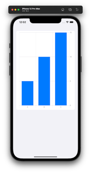
Swift Charts
There are different chart styles we can use in the library.
BarMark, LineMark, AreaMark, PointMark, RectangleMark, RuleMark.
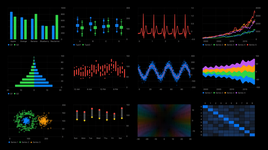
Here is an example of the bar chart.
let chartData: [KeyValue] = [
    .init(key: "A", value: 5),
    .init(key: "B", value: 10),
    .init(key: "C", value: 15)
]

var body: some View {
    Chart(chartData) {
        BarMark(x: .value("Key", $0.key),
                y: .value("Value", $0.value))
    }
}
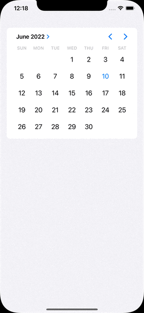
Multi Date Picker
The component provides to choose multi dates through the native date picker.
@State var selectedDates: Set<DateComponents> = []

var body: some View {
    MultiDatePicker("Dates", selection: $selectedDates)
}
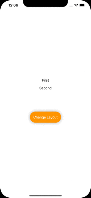
Custom Layout
In case the layout style has to be changed by the user’s interaction, AnyLayoutprovides to achieve it.
@State var changeLayout: Bool = false

var body: some View {
    let layout = changeLayout ? AnyLayout(HStack()) : AnyLayout(VStack())

    VStack {
        layout {
            Text("First")
            Text("Second")
        }

        Button {
            self.changeLayout.toggle()
        } label: {
            Text("Change Layout")
        }
    }
}
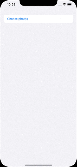
Photos Picker
It is used to choose multiple photos in the album.
@State var selectedPhotos: [PhotosPickerItem] = []

var body: some View {
    PhotosPicker(selection: $selectedPhotos) {
        Text("Choose photos")
    }
}
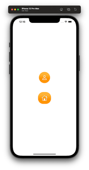
Shape Style Extensions
We can set foreground and background styles to views. These styles support set gradient colors and shadows.
var body: some View {
    VStack {
        VStack {
            Image(systemName: "person")
        }
        .background(in: Circle().inset(by: -20))
        .backgroundStyle(.orange.gradient)
        .foregroundStyle(.white.shadow(.drop(radius: 1)))

        VStack {
            Image(systemName: "house")
        }
        .background(in: RoundedRectangle(cornerRadius: 16).inset(by: -20))
        .backgroundStyle(.orange.gradient)
        .foregroundStyle(.white.shadow(.inner(radius: 1)))
    }
}
ViewThatFits
It decides which view will be fit to the screen and it will be the one only visible.
The longer text won’t fit in the portrait mode, therefore the shorter one will be visible. Since the longer one will be able to fit in the landscape mode, it will be visible.
var body: some View {
    ViewThatFits {
        Text("Hello, I am the longer text and most probably I will be visible only in the landscape mode")
            .frame(width: 700, height: 300)
        Text("Hello, I am the shorter text")
            .frame(width: 300, height: 100)
    }
}
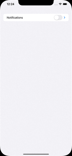
Mixed-State Toggle
Sometimes we need a parent toggle states that are associated with its sub toggles. DisclosureGroup provides a structure for that.
@State var profileNotificationsIsOn: Bool = false
@State var campaignNotificationsIsOn: Bool = false
@State var emailNotificationsIsOn: Bool = false

var body: some View {
    DisclosureGroup {
        Toggle("Profile Notifications", isOn: $profileNotificationsIsOn)
        Toggle("Campaign Notifications", isOn: $campaignNotificationsIsOn)
        Toggle("E-Mail Notifications", isOn: $emailNotificationsIsOn)
    } label: {
        Toggle("Notifications", isOn: [
            $profileNotificationsIsOn,
            $campaignNotificationsIsOn,
            $emailNotificationsIsOn
        ])
    }
 }
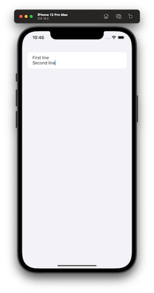
Multiline TextField
In SwiftUI 4, we are able to define specific ranges of a textfield’s line count. Something like, from 1 to 2, from 5 to endless.
@State var textFieldText: String = ""

var body: some View {
    TextField("I am just a text field", text: $textFieldText, axis: .vertical)
        .lineLimit(...2)
}
We’ve tried to list some of the major improvements announced for SwiftUI at WWDC 2022 this year. Of course that’s not all! We’re still digging through the documentation and will add more as we find new additions.
Stick around our blog to find more WWDC 2022 articles.

