Posts

SwiftUI NavigationStack: How to Use the New Navigation View

SwiftUI NavigationStack: How to Use the New Navigation View

SwiftUI has a new NavigationStack view, introduced by Apple at WWDC 2022. It will be available in iOS 16. It allows developers to manage navigation processes more easily by closing the deficiencies of the previously used NavigationView. Apple defines NavigationStack as:

Use a navigation stack to present a stack of views over a root view. People can add views to the top of the stack by clicking or tapping a NavigationLink, and remove views using built-in, platform-appropriate controls, like a back button or a swipe gesture. The stack always displays the most recently added view that hasn’t been removed and doesn’t allow the root view to be removed.

Before starting the details, I would like to remind you that you must use Xcode 14 and above to use all the features of NavigationStack. You can access Xcode 14 from this link.

Left Icon

Seamlessly switch between Xcode versions for iOS Projects!

Right Icon Learn More

Let’s start with an example.

A Simple SwiftUI NavigationStack Usage

NavigationStack {
            NavigationLink("Navigate", value: "AppCircle")
                .navigationDestination(for: String.self) { value in
                    Text("Second screen")
                    Text("Value is \(value)")
            }
}
navigaton

We gave a string to our destination screen. Let’s convert it to a model object. The point here is that whatever the type of value we give in navigationLink is, we need to write that value type in the destination part.

Let’s improve our application by creating a model and add a method to generate some placeholder data.

struct Appcircle: Identifiable, Hashable {
    let id = UUID()
    let brand : String
    let price : Int
    let image : String
}

extension Appcircle {
    static var dummyData: [Appcircle] {
        return [
            .init(brand: "iPhone 13", price: 799, image: "iphone13"),
            .init(brand: "iPhone 4", price: 399, image: "iphone4"),
            .init(brand: "iPhone 8", price: 599, image: "iphone8")
        ]
    }
}

The image values here correspond to image names I’ve imported to my project. Now let’s display these values in our interface:

NavigationStack {
            List(Appcircle.dummyData) { item in
                NavigationLink(item.brand, value: item)
            }
                .listStyle(.plain)
                .navigationDestination(for: Appcircle.self) { item in
                Text(item.brand)
                    .font(.largeTitle)
                    .bold()
                Text("\(item.price)$")
                Image(item.image)
                    .resizable()
                    .scaledToFit()
                    .frame(width: 300)
            }
                .navigationTitle("NavigationStack")
        }
navigationLink

This is the most basic form of using NavigationStack. Let’s take a look at how to manage programmatic navigation via NavigationPath.

NavigationStack can take a parameter named path. (NavigationStack(path: $path))

Let’s create a path and give it as a parameter to NavigationStack. Then, we’ll add a button to our detail screen so that it can reach different screens randomly. We’ll also print the path.count value on the screen to follow its depth easier.

After all these changes, our view code will look like:

struct ContentView: View {
    @State private var path = [Appcircle]()
    var body: some View {
        VStack {
            NavigationStack(path: $path) {
                List(Appcircle.dummyData) { item in
                    NavigationLink(item.brand, value: item)
                }
                    .listStyle(.plain)
                    .navigationDestination(for: Appcircle.self) { item in
                    Text(item.brand)
                        .font(.largeTitle)
                        .bold()
                    Text("\(item.price)$")
                    Image(item.image)
                        .resizable()
                        .scaledToFit()
                        .frame(width: 300)
                    Button("Navigate another page") {
                        path.append(Appcircle.dummyData.randomElement()!)
                    }
                }
                    .navigationTitle("NavigationStack")
            }
            Text("Screen count: \(path.count)")
                .bold()
        }
    }
}

At the moment, we can easily manage our navigation operations programmatically.

Let’s add another button that will return users to the root view. We can give path.removeAll() or path = .init() as an action to the button. Alternatively we can use path.removeLast(2) to go back a certain number of times on the path. This is the final version of our application!

NavigationPath is very effective on pop and push on different data types from the stack as well.

SwiftUI NavigationStack - Full result

PS: NavigationView is deprecated with iOS 16. With this change, you can directly replace existing NavigationViews with NavigationStack. Still, don’t forget to review the init values. The NavigationLink(isActive:destination:label:) we currently use is now deprecated.

Conclusion

Building navigations in our SwiftUI apps was extremely easy with NavigationView. Now with SwiftUI 4.0’s NavigationStack we get more granular controls and the ability to navigate directly to a view that’s deeper in the hierarchy.
To to read our other posts about WWDC22, I highly recommend the Developing with Live Activities API article here.

Swift Charts with SwiftUI – WWDC22

At WWDC 2022, Apple unveiled Swift Charts, a library to plot graphs and charts. Until now, we were dealing with 3rd party libraries to plot data.

By using SwiftUI’s declarative syntax, we can visualize any kind of data with the chart style we want. Swift Charts has a lot of flexibility and allows a wide variety of presentations.

For this article we’ll follow an iOS project that includes all data visualization types announced by Apple.

What does Swift Charts offer?

Before we get down to coding, let’s examine the Charts library. Here is Apple’s definition:

Swift Charts is a powerful and concise SwiftUI framework for transforming your data into informative visualizations. With Swift Charts, you can build effective and customizable charts with minimal code. This framework provides marks, scales, axes, and legends as building blocks that you can combine to develop a broad range of data-driven charts.

Mark

Apple defines items that visually represent data as Mark. Available Mark types are: Bar, Point, Line, Area, Rule, Rectangle.

Scale

As the name suggests, you can scale variables of your charts using Scales. For example, the x or y axis range of the chart, the colors of the Marks, the range of the plot.

What Are We Going to Build Today?

We’ll create different charts. The finished version of our application will look like this:

Area chart

You can access the source code of the final app here.

Description of The Project Structure

As you can imagine, we need a data for all the charts we will create. To meet this need, we created a struct named ChartData and created random data using separate computed property variables for each Mark type. You can find this struct under the Data folder.

Under the Models folder, you can find the models we created to manage the data, as you can imagine. These are: EnergyConsumption, HeartBeat, Person, Production and Sale.

Under the Modules folder, you will see the Charts we created as separate Views.

Line Chart

We often use the line chart to show data that changes over time and to be able to clearly display the change between them.

We used the line chart to show the number of sales made by a seller by day.

Code:

import SwiftUI
import Charts

// MARK: - View
struct LineChartView: View {
    
    // MARK: Properties
    private let chartData = ChartData.lineChartData
    
    // MARK: Body
    var body: some View {
        VStack {
            GroupBox("Sales Count Per Day") {
                Chart(chartData) { sale in
                    LineMark(
                        x: .value("Weekday", sale.date, unit: .hour),
                        y: .value("Count", sale.count)
                    )
                    .interpolationMethod(.cardinal)
                }
                .padding(.horizontal, 16)
            }
            .backgroundStyle(Color.white)
        }
        .navigationTitle("Line Chart")
    }
}

// MARK: - Preview
struct LineChartView_Previews: PreviewProvider {
    static var previews: some View {
        LineChartView()
    }
}

Output:

Line chart

Area Chart

Area Chart basically represents the combined version of line chart and bar chart. Usually, we use it to show the cumulative sum of one or more numeric values based on a second variable.

In our project, we used the area chart to show the annual energy consumption increase.

Code:

import SwiftUI
import Charts

// MARK: - View
struct AreaChartView: View {
    // MARK: Properties
    private let chartData = ChartData.areaChartData
    
    // MARK: Body
    var body: some View {
        VStack {
            GroupBox("Yearly Energy Consumption") {
                Chart(chartData) { consumption in
                    AreaMark(
                        x: .value("", consumption.date, unit: .month),
                        yStart: .value("", consumption.monthlyMinMegawatt),
                        yEnd: .value("", consumption.monthlyMaxMegawatt)
                    )
                }
                .padding(.horizontal)
            }
            .backgroundStyle(Color.white)
        }
        .navigationTitle("Area Chart")
    }
}

// MARK: - Preview
struct AreaChartView_Previews: PreviewProvider {
    static var previews: some View {
        AreaChartView()
    }
}

Output:

Area chart

Bar Chart

Bar Chart is preferred for visualizing numeric values as bars divided into categories.

In our project, we visualized the bus production by month with the help of Bar Chart.

Code:

import SwiftUI
import Charts

// MARK: - View
struct BarChartView: View {
    // MARK: Properties
    private let chartData = ChartData.barChartData
    
    // MARK: Body
    var body: some View {
        VStack {
            GroupBox("Number of Bus Production by Month") {
                Chart(chartData) { production in
                    BarMark(
                        x: .value("Bus Production", production.count),
                        y: .value("Month", production.date, unit: .month)
                    )
                    .foregroundStyle(by: .value("Bus Production", production.count))
                }
                .padding(.horizontal, 16)
            }
            .backgroundStyle(Color.white)
        }
        .navigationTitle("Bar Chart")
    }
}

// MARK: - Preview
struct BarChartView_Previews: PreviewProvider {
    static var previews: some View {
        BarChartView()
    }
}

Output:

Bar chart

Point Chart

Another chart type we use to visualize time-varying values and data groups is Point Chart.

We used the Point Chart to visualize heart rate data, as Apple prefers in the Health app.

Code:

import SwiftUI
import Charts

// MARK: - View
struct PointChartView: View {
    
    // MARK: Properties
    private let chartData = ChartData.pointChartData
    
    // MARK: Body
    var body: some View {
        VStack {
            GroupBox("Heart Beats by Time") {
                Chart(chartData) { person in
                    PointMark(
                        x: .value("Time", person.heartBeat.time, unit: .minute),
                        y: .value("Heart Beat", person.heartBeat.beat)
                    )
                    .foregroundStyle(by: .value("Heart Beat", person.heartBeat.beat))
                }
                .padding(.horizontal, 16)
            }
            .backgroundStyle(Color.white)
        }
        .navigationTitle("Point Chart")
    }
}

// MARK: - Preview
struct PointChartView_Previews: PreviewProvider {
    static var previews: some View {
        PointChartView()
    }
}

Output:

Point chart

Bonus: Mixed Chart

As a bonus, we combined line chart and point chart data in one chart. Swift Charts gives us this convenience in every chart. You can also experiment with different types of graphic creation combinations yourself.

Code:

import SwiftUI
import Charts

// MARK: - View
struct MixedChartView: View {
    
    // MARK: Properties
    private let lineChartData = ChartData.lineChartData
    private let pointChartData = ChartData.pointChartData
    
    // MARK: Body
    var body: some View {
        VStack {
            GroupBox("Mixed: Sales Count & Heart Beat") {
                Chart {
                    ForEach(lineChartData) { sale in
                        LineMark(
                            x: .value("Weekday", sale.date, unit: .minute),
                            y: .value("Count", sale.count)
                        )
                        .interpolationMethod(.cardinal)
                    }
                    .foregroundStyle(.green)
                    
                    ForEach(pointChartData) { person in
                        PointMark(
                            x: .value("Time", person.heartBeat.time, unit: .minute),
                            y: .value("Heart Beat", person.heartBeat.beat)
                        )
                        .foregroundStyle(by: .value("Heart Beat", person.heartBeat.beat))
                    }
                    
                }
                .padding(.horizontal, 16)
            }
            .backgroundStyle(Color.white)
        }
        .navigationTitle("Mixed Chart")
    }
}

// MARK: - Preview
struct MixedChartView_Previews: PreviewProvider {
    static var previews: some View {
        MixedChartView()
    }
}

Output:

Mixed chart

Properties

Now I’m going to show you briefly some of the Properties. You can make changes to your charts by using these properties.

X & Y Position

Actually, we have already used X and Y posts in our Marks. They exist to define our dataset to be located on the X and Y axes.

Foreground Style

We use Foreground Style for options such as coloring and grouping our data. You can see these two options in different Charts within the project. The MixedChart we created would be a good example of this.

Symbol

As the name suggests, we can use Symbol to mark the intersecting points on the X and Y axes in our graphics with different symbols. Thus, you get a graphic that is easy to distinguish.

The chart below is an example of how we can diversify our chart with the Squareand Circle symbols. Moreover, the Charts library does this for us automatically.

Line chart

Line Style

It is used to create new and custom plots for the Marks used in our chart. For example, to create bolder and rounded lines.

Conclusion

As you can see, using a few different modifiers, we can quickly create many different kinds of graphics without much effort.

Of course, these are not the only things we can do with Swift Charts. Apple has released many video series for us. You can learn how to create Charts in different structures by watching these videos.

Where to Go From Here?

Apple Docs — Swift Charts

Hello Swift Charts — WWDC22

Design an Effective Chart — WWDC22

Design App Experiences With Charts — WWDC22

Swift Charts: Raise The Bar — WWDC22

Using SwiftUI inside UICollectionView and UITableView

At WWDC22, Apple introduced UIHostingConfiguration class, which enabled using SwiftUI inside UICollectionView and UITableView. In this article we will use it with the Self-resizing also announced this year feature.

Before using UIHostingConfiguration we need to know what it is actually doing in the background. The SwiftUI view we created via UIHostingConfiguration provides us a contentView at the end of the day. It allows us to replace the default contentView objects by giving this hosting configuration to the contentConfiguration parameter in our cells.

In addition with UIHostingConfiguration we can interfere background color, margins around content and minimum size of configuration. It can also be added in swipe actions.

For the self-resizing there is a point you need to know. In order to use the UICollectionView self-resizing feature you need to use UICollectionLayoutListConfiguration. There is no restriction for UITableView.

Let’s start our development now. In our example project, we will list the episodes and characters of the Rick and Morty series. We will use the UICollectionView for the list of characters and the UITableView for the list of sections.

Project Details

In the sample project we will have a home page, character list and episode list. We will get the Rick and Morty data that will be displayed in our application from https://rickandmortyapi.com.

I will examine the SwiftUI view and self-resizing parts and the rest will be as we use in our usual projects. The entire project will be included at the end of the article.

Left Icon

Empower Your iOS Projects Now!

Right Icon Learn More

Self-Resizing SwiftUI Cells inside UICollectionView (Characters)

While our first job is initialize UICollectionView and inject collectionViewLayout via UICollectionLayoutListConfiguration.

“selfSizingInvalidation” parameter allows us to activate the Self-resizing feature. By default it is enable but by selecting this parameter “enabledIncludingConstraints”. We ensure that it automatically resizes in any auto layout change.

final class CharactersController: UIViewController { 
    
    private lazy var collectionView: UICollectionView = { [weak self] in
    var config = UICollectionLayoutListConfiguration(appearance: .plain)
    config.backgroundColor = .white
    config.showsSeparators = false
    let layout = UICollectionViewCompositionalLayout.list(using: config)
    let collectionView = UICollectionView(
        frame: .zero,
        collectionViewLayout: layout
    )
    collectionView.translatesAutoresizingMaskIntoConstraints = false
    collectionView.dataSource = self
    collectionView.register(
        CharacterCollectionViewCell.self,
        forCellWithReuseIdentifier: CharacterCollectionViewCell.description()
    )
    collectionView.selfSizingInvalidation = .enabledIncludingConstraints
    return collectionView
 }()
    
 func collectionView(_ collectionView: UICollectionView, cellForItemAt indexPath: IndexPath) -> UICollectionViewCell {
     guard let cell = collectionView.dequeueReusableCell(
         withReuseIdentifier: CharacterCollectionViewCell.description(),
         for: indexPath
     ) as? CharacterCollectionViewCell else {
         return UICollectionViewCell()
     }
     cell.output = self
     cell.configure(with: viewModel.datas[indexPath.item])
     return cell
 }
}

Now the UICollectionView is ready for Self-resizing. Now it’s time to use the SwiftUI view in our UICollectionViewCell.

With the CharacterCollectionViewCell configure function we replace the cell’s own contentView with the new SwiftUI view. We update the UIHostingConfiguration with the modifiers, the background color and the default margins and spaces as we want. Now our current contentView is the view we created with SwiftUI.

import UIKit
import SwiftUI

protocol CharacterCollectionViewCellOutput: CharacterViewOutput {}

final class CharacterCollectionViewCell: UICollectionViewCell {

    weak var output: CharacterCollectionViewCellOutput?

    override func prepareForReuse() {
        super.prepareForReuse()

        contentConfiguration = nil
    }

    func configure(with viewModel: CharacterCollectionViewCellViewModel) {
        self.contentConfiguration = UIHostingConfiguration {
            var view = CharacterView(isExpanded: viewModel.isExpanded, viewModel: viewModel)
            view.output = self
            return view
        }
        .background(.white)
        .margins(.all, 20)
    }
}

extension CharacterCollectionViewCell: CharacterViewOutput {
    func didTapButton(with viewModel: CharacterCollectionViewCellViewModel, isExpanded: Bool) {
        output?.didTapButton(with: viewModel, isExpanded: isExpanded)
        //UIView.performWithoutAnimation {
         //   self.invalidateIntrinsicContentSize()
        //}
    }
}

When the view we have created needs to be resized, the size will change automatically. If size does not change, you can call invalidateIntrinsicContentSize() in cell’ to trigger it manually. if you use the part I commented you can see the size changes without animation.

import Kingfisher
import SwiftUI

protocol CharacterViewOutput: AnyObject {
    func didTapButton(with viewModel: CharacterCollectionViewCellViewModel, isExpanded: Bool)
}

struct CharacterView: View {

    weak var output: CharacterViewOutput?

    @State var isExpanded = false

    var viewModel: CharacterCollectionViewCellViewModel

    var body: some View {
        VStack {
            HStack(spacing: 8) {
                KFImage(viewModel.imageUrl)
                    .resizable()
                    .loadDiskFileSynchronously()
                    .cacheMemoryOnly()
                    .placeholder {
                        ProgressView()
                            .tint(.white)
                    }
                .frame(width: 100, height: 100)
                .cornerRadius(8)
                VStack {
                    CharacterTitleView(name: viewModel.name, species: viewModel.species)
                    Spacer()
                    HStack {
                        Spacer()
                        Button {
                            isExpanded = !isExpanded
                            output?.didTapButton(with: viewModel, isExpanded: isExpanded)
                        } label: {
                            Text(isExpanded ? "Show Less" : "Show More")
                                .padding(10)
                                .bold()
                        }
                        .tint(Color.white)
                        .background(Color.orange)
                        .cornerRadius(8)
                    }
                    .padding([.trailing], 8)
                }
                .padding([.top, .bottom], 8)
            }
            if isExpanded {
                CharacterDetailsView(
                    lastKnown: viewModel.location,
                    firstSeen: viewModel.origin,
                    gender: viewModel.gender,
                    status: viewModel.status
                )
                .transition(.slide)
            }
        }
        .padding(8)
        .background(Color.customDarkGray)
        .cornerRadius(8)
        .shadow(radius: 4, x: 2, y: 2)
    }
}

Our result for the Characters screen will be as shown.

Characters screen

Self-Resizing SwiftUI Cells inside UITableView (Episodes)

Now it’s time for UITableView. We will use SwiftUI view with cell swipe support, which you can resize as well.

Using UITableView is much easier than UICollectionView. You just have to set “selfSizingInvalidation” to “enabledIncludingConstraints”. As we said on the UICollectionView side selfSizingInvalidation is enabled by default but we set it to “enabledIncludingConstraints” so that it can be resized in all auto layout changes. Even ready for self-resize.

final class EpisodesController: UIViewController {

    private lazy var tableView: UITableView = { [weak self] in
        let tableView = UITableView()
        tableView.separatorStyle = .none
        tableView.allowsSelection = false
        tableView.translatesAutoresizingMaskIntoConstraints = false
        tableView.register(EpisodeTableViewCell.self, forCellReuseIdentifier: EpisodeTableViewCell.description())
        tableView.delegate = self
        tableView.dataSource = self
        tableView.selfSizingInvalidation = .enabledIncludingConstraints
        return tableView
    }()
}

We place our own SwiftUI view instead of the cell’s own contentView via UIHostingConfiguration. In order to add swipe action, we add the feature of SwiftUI view by adding a modifier. In “.swipeAction”‘s they get SwiftUI views into their content. The rest is traditionally deleting the cell via the UITableView with output delegation.

If you want to trigger our cell’s resize manually, you can trigger invalidateIntrinsicContentSize(). Also it’ll provide the ability to resize without animation in the part I put in the comment line.

import UIKit
import SwiftUI

protocol EpisodeTableViewCellOutput: EpisodeViewOutput {
    func didTapDelete(_ cell: EpisodeTableViewCell)
}

final class EpisodeTableViewCell: UITableViewCell {

    weak var output: EpisodeTableViewCellOutput?

    override func prepareForReuse() {
        super.prepareForReuse()

        contentConfiguration = nil
    }

    func configure(with viewModel: EpisodeTableViewCellViewModel) {
        self.contentConfiguration = UIHostingConfiguration {
            EpisodeView(output: self, isExpanded: viewModel.isExpanded, viewModel: viewModel)
            .swipeActions(allowsFullSwipe: true) {
                Button("Delete") { [weak self] in
                    guard let self else {
                        return
                    }
                    self.output?.didTapDelete(self)
                }
            }
            .tint(Color.red)
        }
        .background(.white)
        .margins(.all, 20)
    }
}

extension EpisodeTableViewCell: EpisodeViewOutput {
    func didTapButton(with viewModel: EpisodeTableViewCellViewModel, isExpanded: Bool) {
        output?.didTapButton(with: viewModel, isExpanded: isExpanded)
        //UIView.performWithoutAnimation {
         //   self.invalidateIntrinsicContentSize()
        //}
    }
}

Our UITableView example is complete:

UITableView example

Conclusion

With iOS 16, UITableView and UICollectionView now have a much more flexible structure. Now we can use the views developed with UIKit and SwiftUI together. With your knowledge on the UIKit side and the innovations on the SwiftUI side, there is a lot to discover. You can find the sample project below. Stay tuned.

https://github.com/ferhanakkan/SwiftUIInUICollectionViewAndUITableView

Where to Go From Here?

Check Apple’s Documentation for more detailed description on how we can use SwiftUI inside UICollectionView and UITableView.

Apple Docs — Content Configuration

Apple Docs — Self-resizing

Apple Docs — UIHostingConfiguration

What is New in SwiftUI 4.0, WWDC 2022

WWDC 22 is passed so quick, isn’t it? SwiftUI is one of the most awaited subjects from developers in WWDC 22. Some of the developers are satisfied with the new features for SwiftUI, but some are not.

Here are the features that will be in SwiftUI 4.0, iOS 16.

Hide Home Button(Indicator)

Apple’s Documentation

Some screens are required a lot of taps and focus from the user. To achieve this goal, we can hide the bottom native indicator in SwiftUI not.

var body: some View {
    EmptyView()
        .persistentSystemOverlays(.hidden)
}

Hide Home Button(Indicator)

Navigation Stack

Apple’s Documentation

The new way to manage navigations instead of NavigationView.

With the new NavigationStack, we can define multiple destinations by the model.

let vehicles: [Vehicle] = [
    .init(name: "Car", iconName: "car"),
    .init(name: "Bus", iconName: "bus"),
    .init(name: "Airplane", iconName: "airplane")
]

var body: some View {
    NavigationStack {
        List(vehicles) { vehicle in
            NavigationLink(value: vehicle) {
                Label(vehicle.name, systemImage: vehicle.iconName)
            }
        }
        .navigationDestination(for: Vehicle.self) { vehicle in
            VehicleDetailView(vehicle: vehicle)
        }
    }
}

Navigation Stack

Half Sheet

It is one of the features developers mostly demand. Finally, Apple is making it public for us!

All we need to do is call the presentationDetents function of the view we will show as the half sheet.

The function takes detents as the parameter to set the height of the sheet. We can also set a constant height by typing .height(200).

@State var isPresentedHalfSheet: Bool = false

var body: some View {
    Button {
        self.isPresentedHalfSheet.toggle()
    } label: {
        Text("Present half sheet")
    }
    .sheet(isPresented: $isPresentedHalfSheet) {
        HalfSheetView()
            .presentationDetents([.medium, .large])
    }
}

Half Sheet

Swift Charts

Apple’s Documentation

There are different chart styles we can use in the library.

BarMark, LineMark, AreaMark, PointMark, RectangleMark, RuleMark.

Swift Charts

Here is an example of the bar chart.

let chartData: [KeyValue] = [
    .init(key: "A", value: 5),
    .init(key: "B", value: 10),
    .init(key: "C", value: 15)
]

var body: some View {
    Chart(chartData) {
        BarMark(x: .value("Key", $0.key),
                y: .value("Value", $0.value))
    }
}

Swift Charts

Multi Date Picker

Apple’s Documentation

The component provides to choose multi dates through the native date picker.

@State var selectedDates: Set<DateComponents> = []

var body: some View {
    MultiDatePicker("Dates", selection: $selectedDates)
}

Multi Date Picker

Custom Layout

Apple’s Documentation

In case the layout style has to be changed by the user’s interaction, AnyLayoutprovides to achieve it.

@State var changeLayout: Bool = false

var body: some View {
    let layout = changeLayout ? AnyLayout(HStack()) : AnyLayout(VStack())

    VStack {
        layout {
            Text("First")
            Text("Second")
        }

        Button {
            self.changeLayout.toggle()
        } label: {
            Text("Change Layout")
        }
    }
}

Custom Layout

Photos Picker

Apple’s Documentation

It is used to choose multiple photos in the album.

@State var selectedPhotos: [PhotosPickerItem] = []

var body: some View {
    PhotosPicker(selection: $selectedPhotos) {
        Text("Choose photos")
    }
}

Photos Picker

Shape Style Extensions

We can set foreground and background styles to views. These styles support set gradient colors and shadows.

var body: some View {
    VStack {
        VStack {
            Image(systemName: "person")
        }
        .background(in: Circle().inset(by: -20))
        .backgroundStyle(.orange.gradient)
        .foregroundStyle(.white.shadow(.drop(radius: 1)))

        VStack {
            Image(systemName: "house")
        }
        .background(in: RoundedRectangle(cornerRadius: 16).inset(by: -20))
        .backgroundStyle(.orange.gradient)
        .foregroundStyle(.white.shadow(.inner(radius: 1)))
    }
}

Shape Style Extensions

ViewThatFits

Apple’s Documentation

It decides which view will be fit to the screen and it will be the one only visible.

The longer text won’t fit in the portrait mode, therefore the shorter one will be visible. Since the longer one will be able to fit in the landscape mode, it will be visible.

var body: some View {
    ViewThatFits {
        Text("Hello, I am the longer text and most probably I will be visible only in the landscape mode")
            .frame(width: 700, height: 300)
        Text("Hello, I am the shorter text")
            .frame(width: 300, height: 100)
    }
}

ViewThatFits

Mixed-State Toggle

Apple’s Documentation

Sometimes we need a parent toggle states that are associated with its sub toggles. DisclosureGroup provides a structure for that.

@State var profileNotificationsIsOn: Bool = false
@State var campaignNotificationsIsOn: Bool = false
@State var emailNotificationsIsOn: Bool = false

var body: some View {
    DisclosureGroup {
        Toggle("Profile Notifications", isOn: $profileNotificationsIsOn)
        Toggle("Campaign Notifications", isOn: $campaignNotificationsIsOn)
        Toggle("E-Mail Notifications", isOn: $emailNotificationsIsOn)
    } label: {
        Toggle("Notifications", isOn: [
            $profileNotificationsIsOn,
            $campaignNotificationsIsOn,
            $emailNotificationsIsOn
        ])
    }
 }

Mixed-State Toggle

Multiline TextField

Apple’s Documentation

In SwiftUI 4, we are able to define specific ranges of a textfield’s line count. Something like, from 1 to 2, from 5 to endless.

@State var textFieldText: String = ""

var body: some View {
    TextField("I am just a text field", text: $textFieldText, axis: .vertical)
        .lineLimit(...2)
}

Multiline TextField

We’ve tried to list some of the major improvements announced for SwiftUI at WWDC 2022 this year. Of course that’s not all! We’re still digging through the documentation and will add more as we find new additions.

Stick around our blog to find more WWDC 2022 articles.

Dynamic Localization in SwiftUI

We must have seen some cool apps that change the app language in real-time. Although Apple does not recommend it we sometimes need real-time localization to provide a better app environment. There are some ways to achieve that in UIKit but this article is only about SwiftUI.

TL;DR

By using Combine’s power, connect a localization manager to an environment object and localize texts via the localization manager.

Localization

Why we need real-time localization in SwiftUI?

Simple, we want cool apps! Besides the fancy reasons, asking Hey! Relaunch the app to see the language change please is kind of hard work for the user. We should always focus on the easiest usage of the app.

The Result

Localization result in mobile

Localization manager

The magic happens here:

[gist id=”ad2c575218a26493e5c1331b87bbc978″ /]

LocalizationManager must implement ObservableObject protocol to be observed from views.

language is the property to be observed hence it starts with Published property wrapper.

P.S. Published is one of the property wrappers in SwiftUI that allows us to trigger a view redraw whenever changes occur. More details

localize function takes the key as a parameter to look for its value. In a different way than the usual localization process, it checks if the project bundle has lprojfile which is related to the language.

P.S. Projects have localizable files as lproj formats. For the English language, it will be en.lproj.

Left Icon

Empower Your iOS Projects Now!

Right Icon Learn More

Accessing localization manager

Somehow we need to share and listen to the localization manager all over the app. Therefore, another property wrapper comes to help us, Environment Object.

P.S. Environment Object is an easy way to share data between views in SwiftUI. It also provides to update the view automatically when data changes. More details

[gist id=”86c4e7a316d81afc5094bb7407f2f52c” /]

We have AppEnvironment class which will be used as an environment object. Since it will be observed like localization manager, we are implementing ObservableObject again.

localizationManagerWillChange is a bridge to trigger localization manager’s objectWillChange property.

P.S. objectWillChange is the manuel way to update the data as Published property does it automatically.

View

We have a content view to simulate the process.

[gist id=”e26252614f9ba36700fb0c173e4574d5″ /]

At the 9. line we can see a localization process. We have a Localizable.string file that is localized in English and Turkish languages. Both files have the key as helloWorld.

On the screen, we also have 2 buttons to change the language dynamically. All we need to do is change language property in the language manager to change the language.

Usage of app environment

We initialize the app environment in the main app class.

[gist id=”444b32681e3f2ee006bcee1079c6dab4″ /]

And send to ContentView by using environmentObject.

Alternative scenarios

With the approach in this article, we can fetch/download localizable strings from remote and store in the localization manager. By using the localize function, we can look for the value of the related key.

In conclusion

Realtime localization is possible by using Combine’s powerful protocols and property wrappers. We need a localization manager class that will be observed. It must be connected to the environment object. These 2 components communicate with each other and adapt to the new language automatically.

Where to go from here

There are similar approaches to solve the same problem. I’ve listed two of them below:

Dynamic localization in SwiftUI with locale → https://kowei-chen.medium.com/swiftui-dynamic-localization-tricks-87c37a6db3e7

Dynamic localization in UIKit with lproj path → https://codewithbharathi.medium.com/localisation-in-ios-e88ef27b6faa

Major iOS15 API Changes for Developers

Major iOS 15 API Changes for Developers

Every year after WWDC, developers who make apps for iOS start working on all the changes and add new features. With next release coming in Autumn/Fall of 2021, we’ve put up a comprehensive list of developer-facing iOS 15 API changes for developers.

Brand New APIs

Apple introduced a few brand new user-centric features for iOS 15, which was also the highlight of the WWDC21 keynote.
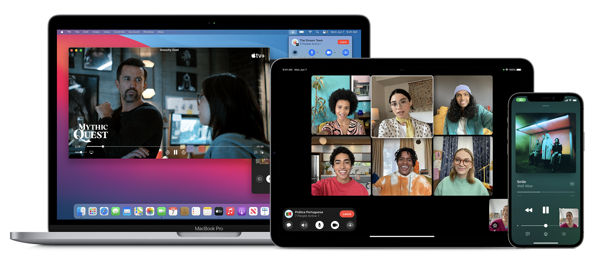
SharePlay

With SharePlay, your app’s features can be shared through FaceTime calls. If you have a media streaming app, you can use SharePlay APIs to let users watch or listen to media simultaneously. If your app is using AVFoundation to display content, then most of the work will be handled automatically. All you have to do is to use the new Group Activities API (https://developer.apple.com/documentation/GroupActivities) to provide that your app supports SharePlay and details about your content.

shareplay image

Note: Apple recently released a statement that SharePlay feature won’t be available on the initial release of iOS 15. It’ll be added via an update later this fall. More information here: https://developer.apple.com/news/?id=mxaeu6er

Focus Mode

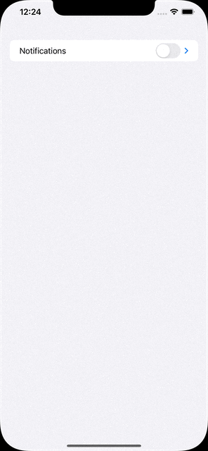
Prior to iOS 15, users had the option to turn on Do Not Disturb mode to eliminate distraction from notifications and calls. iOS 15 adds the option to create different Focus Modes. Every mode can have their own list of allowed apps and contact list. Modes can be activated via a location change (arriving at the office), a time schedule, or when an app launches (when I launch Mail or Xcode).

In support of focus modes, Apple also introduced notification importance levels. With it, the system can determine whether to display a very important notification, breaking the rules of Focus mode, or not display a trivial notification until focus mode ends. Your app needs to categorize the notification types.

To see the types and how to configure, check the Notifications segment in Human Interface Guidelines: https://developer.apple.com/design/human-interface-guidelines/ios/system-capabilities/notifications

App Store Changes

App Store is getting new capabilities that will help you marketing your app. You can now create versions of your product detail pages and target them to different segments of potential users. If you have special events for a time period, App Store can display these events on the home page.

App Store

StoreKit API got a major new version as well. With StoreKit 2, Apple has simplified the use of StoreKit, implementing modern Swift features.

There is a new App Store Server REST API as well. Developers can query subscription statuses, get in-app purchase history of a user, and can send usage data to Apple in case the user asks for a refund.

Later this year, apps can extend the subscription’s deadline up to 90 days due to an error in their content delivery. Ability to look up a user’s refund history and retrieve invoices from an order id is also coming later this year. More information on the server API here: https://developer.apple.com/documentation/appstoreserverapi

Apple’s beta distribution platform, Testflight can distribute Mac apps now. It only works for macOS 12 (Monterey) apps though.

ScreenTime API

With the ScreenTime API, apps can apply parental controls based on the app’s usage via the ScreenTime API.

More on ScreenTime API here: https://developer.apple.com/videos/play/wwdc2021/10123/

ShazamKit

Now developers can use Shazam’s audio recognition capabilities in their own apps.

More on ShazamKit here: https://developer.apple.com/shazamkit/

Nearby Interaction API

If you’re making an accessory that communicates with an Apple Device that has a U1 chip, you can use the Nearby Interaction API to make UWB (Ultra Wideband) communication between the device and your app. Apple uses this API to help users locate AirTags.

More on Nearby Interaction API here: https://developer.apple.com/nearby-interaction/

Object Capture

Added with RealityKit 2, Object Capture turns your Apple device into a 3D scanner. By taking multiple images of a real-world object, the object is turned into a detailed 3D model you can use and distribute.

More on Object Capture here: https://developer.apple.com/augmented-reality/object-capture/
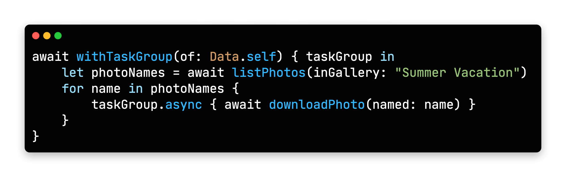
Swift

Swift Programming Language is getting lots of new features this year. Main focus during WWDC21 was on Concurrency. With it, Swift gets the async/await syntax to handle asynchronous code. All async functions inside iOS SDK is also updated for this new syntax.

Concurrency in Swift Example COde

Unfortunately, Apple acknowledged that concurrency features will not be backwards compatible, meaning it will only run on iOS 15 and above. But there is always hope: https://github.com/apple/swift/pull/39051

Conversion between CGFloat and Double

Starting with Swift 5.5, the compiler can convert Double values to CGFloat and vice versa, which previously required explicit type declaration.
https://github.com/apple/swift-evolution/blob/main/proposals/0307-allow-interchangeable-use-of-double-cgfloat-types.md

Other Swift 5.5 Additions

There are other Swift improvements like local lazy variables, Swift package collections, and Codable support to enum cases with associated values, and more.

Check the WWDC session video for a deeper dive at what’s added: https://developer.apple.com/videos/play/wwdc2021/10192/

SwiftUI

Apple’s new declarative UI framework, SwiftUI is getting developers excited for new additions every WWDC. Here are some of the SwiftUI changes in iOS 15:

AsyncImage

SwiftUI now has a view type that can load images asynchronously.

https://developer.apple.com/documentation/swiftui/asyncimage/

Refreshable

Any View can have pull-to-refresh functionality, and List views get UI handling automatically.
https://developer.apple.com/documentation/swiftui/label/refreshable(action:)

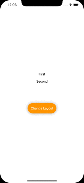
Animation modifier change

.animation() modifier caused glitches when a value that’s not associated with the animation was updated, or any time a system-wide animation is triggered (like rotating the phone to landscape). New .animation(_ value:) modifier changes that. It triggers the animation when only passed binding value updates.

Search bars

search bars

Any view inside a NavigationView can use .searchable() modifier, which adds a search bar to the top of the view and calls a closure whenever the search query changes. Listening to changes can be disabled and search closure gets called when user taps a button. You can even add search suggestions.
More on search here: https://developer.apple.com/videos/play/wwdc2021/10176/

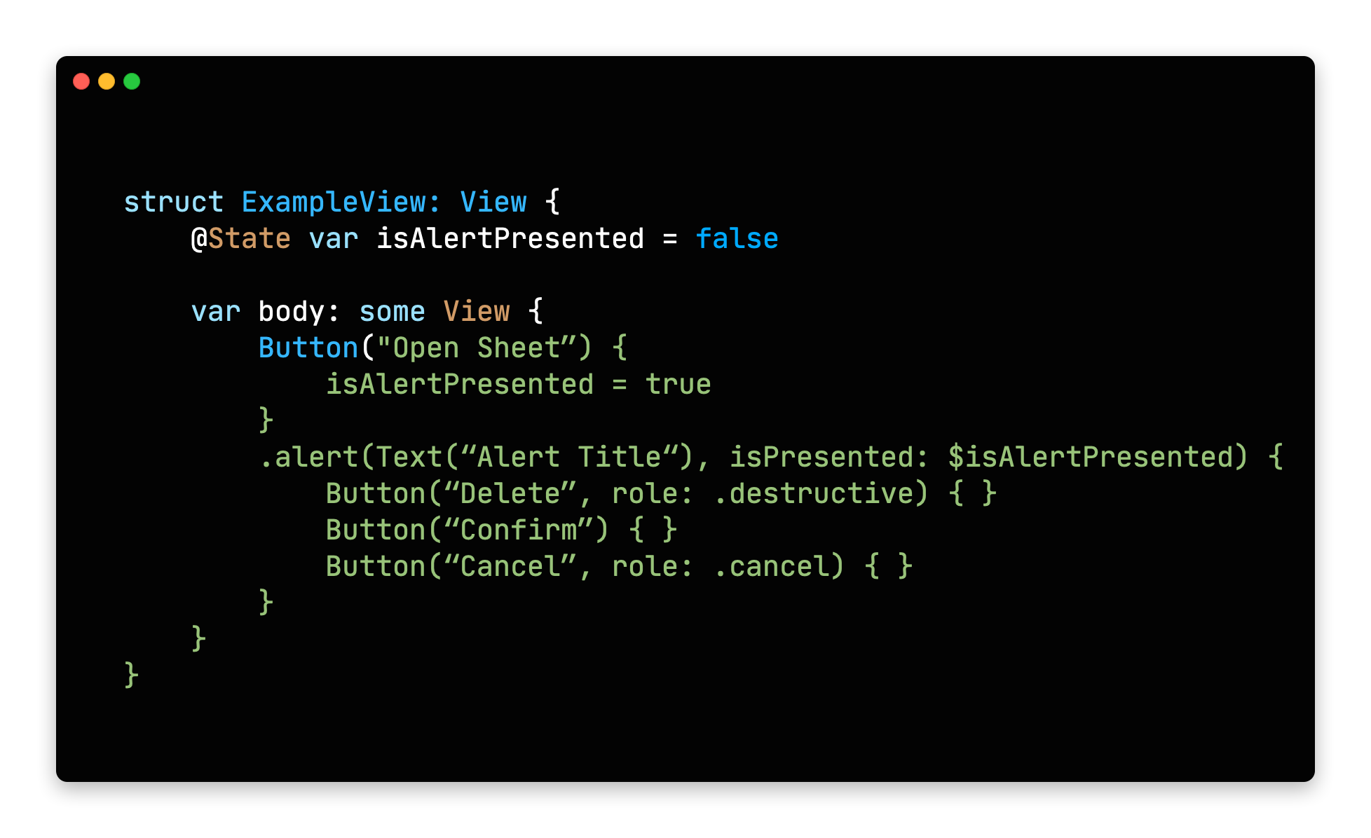
Changes to Alert and ActionSheet syntax

Previously, alert modifiers required to explicitly create actions inside an alert, the alert itself and finally return the alert. New syntax lets developers define buttons with roles and that’s it.

action sheet in swift ui

Buttons with roles

SwiftUI’s Button type initializer now can take a ButtonRole object. The predefined values for ButtonRole is the same as the ActionSheet actions: destructive, cancel and default(pass nil to make a button default)
https://developer.apple.com/documentation/swiftui/buttonrole/

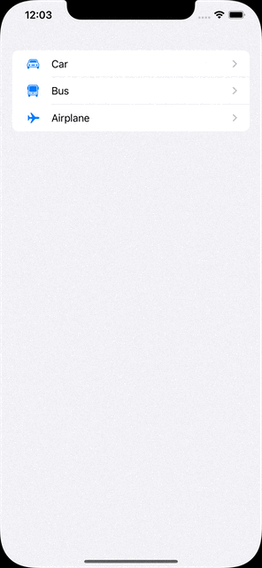
Updates to List (list element bindings, individual separator insets, custom swipe actions)

We knew that SwiftUI’s List view was using UITableView in the background, but it missed UITableView’s customization and flexibility. With the next release, SwiftUI adds bindings to list elements individually, separator insets can be configured on cell level and custom swipe actions can now be added.
https://developer.apple.com/documentation/swiftui/list/

.task()

Previously, we used .onAppear() modifier to load async content after a view got displayed. Now there is a more safe .task() modifier to run async tasks after a view is rendered initially.

For more in depth information and other improvements, check out WWDC’s What’s New in SwiftUI session: https://developer.apple.com/videos/play/wwdc2021/10018/

We also suggest all SwiftUI developers to watch “Demystify SwiftUI” talk as well: https://developer.apple.com/videos/play/wwdc2021/10022/

Xcode

Xcode 13 also got many improvements this year.

Custom documentation with DocC

Xcode now takes markdown comments and inline documentation and displays them with Apple’s own documentation style. DDoC format can also be used outside Xcode, but it’s not widely supported yet.

Better version control

Apple added support for Code Reviews and Pull Requests. Version control tab also got many small improvements.

Vim Mode

For those who are used to Vim’s commands, Xcode now has a Vim Mode that maps all vim keyboard commands to Xcode. To enable select Editor -> Vim Mode.

Better code completion

Xcode now auto fills when you are unwrapping an optional with if-let, and switch cases gets auto-filled as well.

Foundation and UIKit

New Swift AttributedString Type

Swift now has its own AttributedString type. Create an AttributeContainer value to style chunks of text.

It also has built-in markdown support. All SwiftUI Text types are also accepting AttributedString values.
https://developer.apple.com/documentation/foundation/attributedstring

Date() -> Date.now

Date class now has a direct property to get the current date and time. A nice to have addition.
https://developer.apple.com/documentation/foundation/date/3766590-now/

Changes to UIWindow key window behavior

If your app is using multiple windows and calling making them key window, the behavior is changing in iOS 15:

Improvements to UICollectionView and UITableView Cell Prefetching and Reloads

UIKit team also made improvements to the way cells are prefetched in a UITableView and UICollectionView. This brings a large performance benefit.

They also added the reconfigure method, which lets you directly update a certain cell, instead of reloading the entire table view. More info on both is here:
https://developer.apple.com/videos/play/wwdc2021/10252/

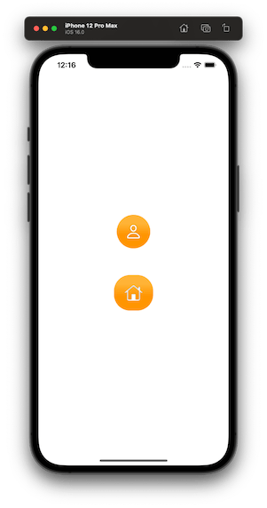
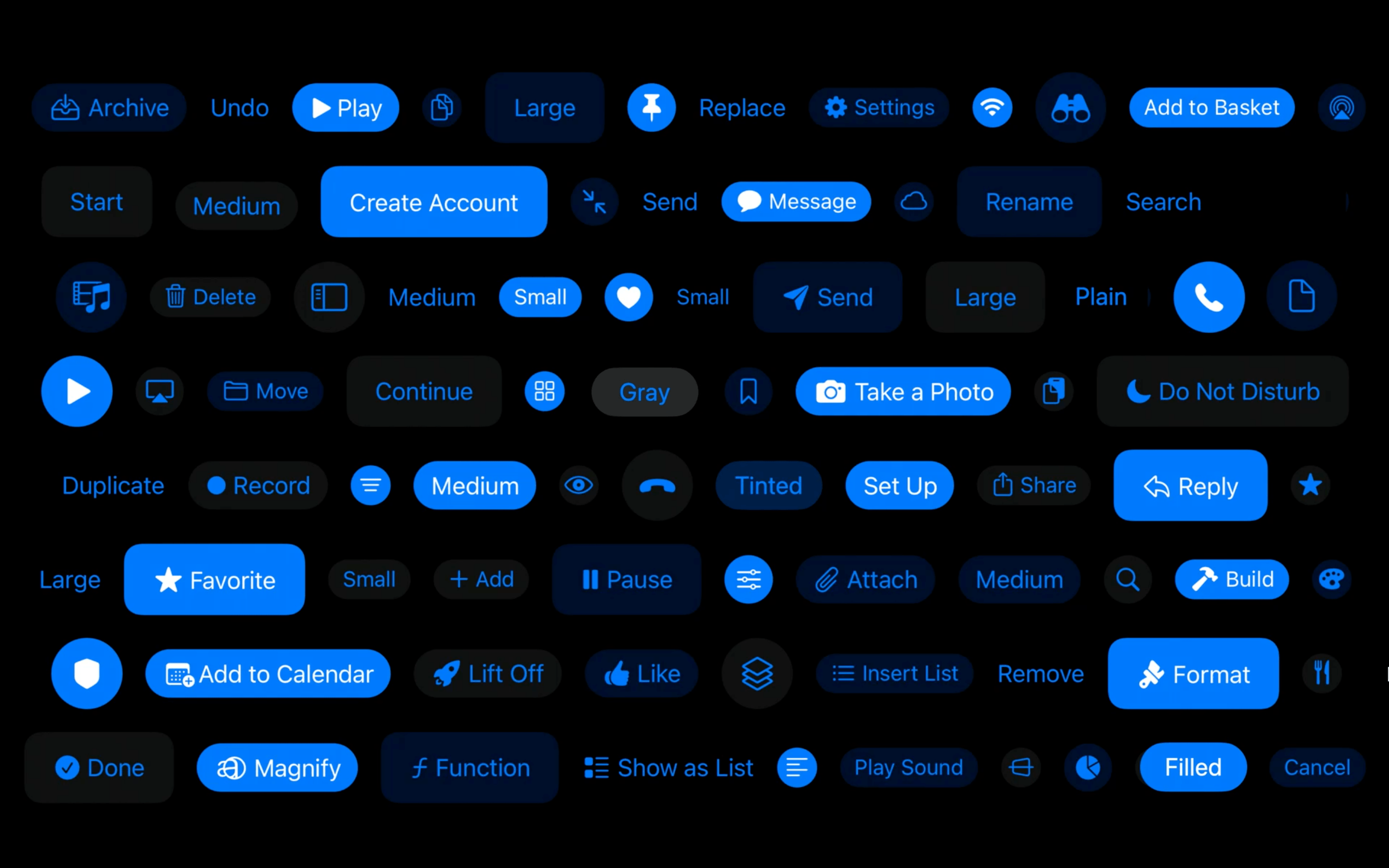
UIButton Configuration

New UIButton Styling

UIButton class got more customizable thanks to the UIButton.Configuration object. Title, subtitle, image setup, paddings between items, background/foreground color and many more options are available. You can define these styles or override the predefined styles to fit your app’s design system.
https://developer.apple.com/documentation/uikit/uibutton/configuration
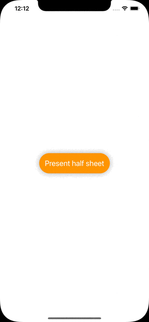
Bottom Sheets

UIKit has support for bottom drawer sheets in iOS 15. UISheetPresentationController class lets you present smaller-than fullscreen sheets inside your app. Sheets can determine their height by using detents. Detents are height breakpoints that the sheet can grow/shrink to.

More information here:
https://developer.apple.com/videos/play/wwdc2021/10063/
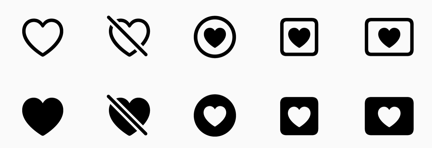
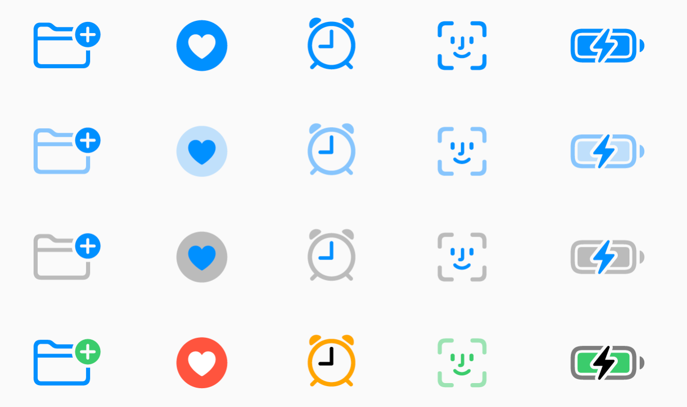
SF Symbols

Apple’s Design team makes new additions every year to help designers and developers to make better functioning apps. SF Symbols was a step in this direction. This year, SF Symbols got a lot more new symbols and more features.

Symbol Variants

Apple grouped symbols into variants. A symbol can have a regular, slashed, enclosed and other versions within the same group.

Variants in SF Symbols 3

There are also variants for icons for different languages and writing styles.

Localized variants for sf symbols

Symbol Colors

Now designers can pick between different styles of the symbols. Previously we had monochrome and multicolor variants. Now there are 2 new styles: Hierarchical and Palette. You can pick a single base color for hierarchical style or two colors for palette to modify icons based on your app’s color palette.

Symbol Colors

Custom Symbols

Now designers can also add their own custom symbols to sf symbols. Developers than can import them to their project and all the benefits of the SF Symbols arrive with them.

For all the new additions to SF Symbols check the WWDC talk: https://developer.apple.com/videos/play/wwdc2021/10097/

SF Arabic

San Francisco is Apple’s official font for all their products. This year, they added an Arabic version of the San Francisco font, called SF Arabic. You can download SF Arabic and all other Apple fonts here: https://developer.apple.com/fonts/

There are many other additions, changes and improvements on iOS 15, and listing all of them here would be impossible. We’ve tried to list major developer-facing iOS 15 API changes for developers.

To try out and use all the new additions, you need to use Xcode 13. As Appcircle, we support building with Xcode 13. And every new beta is available within 24 hours after its release. You can start using Appcircle for free.