
Using SwiftUI inside UICollectionView and UITableView
At WWDC22, Apple introduced UIHostingConfiguration class, which enabled using SwiftUI inside UICollectionView and UITableView. In this article we will use it with the Self-resizing also announced this year feature.
Before using UIHostingConfiguration we need to know what it is actually doing in the background. The SwiftUI view we created via UIHostingConfiguration provides us a contentView at the end of the day. It allows us to replace the default contentView objects by giving this hosting configuration to the contentConfiguration parameter in our cells.
In addition with UIHostingConfiguration we can interfere background color, margins around content and minimum size of configuration. It can also be added in swipe actions.
For the self-resizing there is a point you need to know. In order to use the UICollectionView self-resizing feature you need to use UICollectionLayoutListConfiguration. There is no restriction for UITableView.
Let’s start our development now. In our example project, we will list the episodes and characters of the Rick and Morty series. We will use the UICollectionView for the list of characters and the UITableView for the list of sections.
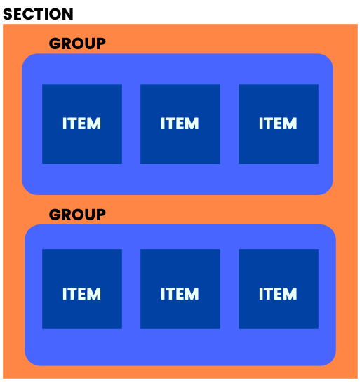
Project Details
In the sample project we will have a home page, character list and episode list. We will get the Rick and Morty data that will be displayed in our application from https://rickandmortyapi.com.
I will examine the SwiftUI view and self-resizing parts and the rest will be as we use in our usual projects. The entire project will be included at the end of the article.
Self-Resizing SwiftUI Cells inside UICollectionView (Characters)
While our first job is initialize UICollectionView and inject collectionViewLayout via UICollectionLayoutListConfiguration.
“selfSizingInvalidation” parameter allows us to activate the Self-resizing feature. By default it is enable but by selecting this parameter “enabledIncludingConstraints”. We ensure that it automatically resizes in any auto layout change.
final class CharactersController: UIViewController {

    private lazy var collectionView: UICollectionView = { [weak self] in
    var config = UICollectionLayoutListConfiguration(appearance: .plain)
    config.backgroundColor = .white
    config.showsSeparators = false
    let layout = UICollectionViewCompositionalLayout.list(using: config)
    let collectionView = UICollectionView(
        frame: .zero,
        collectionViewLayout: layout
    )
    collectionView.translatesAutoresizingMaskIntoConstraints = false
    collectionView.dataSource = self
    collectionView.register(
        CharacterCollectionViewCell.self,
        forCellWithReuseIdentifier: CharacterCollectionViewCell.description()
    )
    collectionView.selfSizingInvalidation = .enabledIncludingConstraints
    return collectionView
 }()

 func collectionView(_ collectionView: UICollectionView, cellForItemAt indexPath: IndexPath) -> UICollectionViewCell {
     guard let cell = collectionView.dequeueReusableCell(
         withReuseIdentifier: CharacterCollectionViewCell.description(),
         for: indexPath
     ) as? CharacterCollectionViewCell else {
         return UICollectionViewCell()
     }
     cell.output = self
     cell.configure(with: viewModel.datas[indexPath.item])
     return cell
 }
}
Now the UICollectionView is ready for Self-resizing. Now it’s time to use the SwiftUI view in our UICollectionViewCell.
With the CharacterCollectionViewCell configure function we replace the cell’s own contentView with the new SwiftUI view. We update the UIHostingConfiguration with the modifiers, the background color and the default margins and spaces as we want. Now our current contentView is the view we created with SwiftUI.
import UIKit
import SwiftUI

protocol CharacterCollectionViewCellOutput: CharacterViewOutput {}

final class CharacterCollectionViewCell: UICollectionViewCell {

    weak var output: CharacterCollectionViewCellOutput?

    override func prepareForReuse() {
        super.prepareForReuse()

        contentConfiguration = nil
    }

    func configure(with viewModel: CharacterCollectionViewCellViewModel) {
        self.contentConfiguration = UIHostingConfiguration {
            var view = CharacterView(isExpanded: viewModel.isExpanded, viewModel: viewModel)
            view.output = self
            return view
        }
        .background(.white)
        .margins(.all, 20)
    }
}

extension CharacterCollectionViewCell: CharacterViewOutput {
    func didTapButton(with viewModel: CharacterCollectionViewCellViewModel, isExpanded: Bool) {
        output?.didTapButton(with: viewModel, isExpanded: isExpanded)
        //UIView.performWithoutAnimation {
         //   self.invalidateIntrinsicContentSize()
        //}
    }
}
When the view we have created needs to be resized, the size will change automatically. If size does not change, you can call invalidateIntrinsicContentSize() in cell’ to trigger it manually. if you use the part I commented you can see the size changes without animation.
import Kingfisher
import SwiftUI
protocol CharacterViewOutput: AnyObject {
func didTapButton(with viewModel: CharacterCollectionViewCellViewModel, isExpanded: Bool)
}
struct CharacterView: View {
weak var output: CharacterViewOutput?
@State var isExpanded = false
var viewModel: CharacterCollectionViewCellViewModel
var body: some View {
VStack {
HStack(spacing: 8) {
KFImage(viewModel.imageUrl)
.resizable()
.loadDiskFileSynchronously()
.cacheMemoryOnly()
.placeholder {
ProgressView()
.tint(.white)
}
.frame(width: 100, height: 100)
.cornerRadius(8)
VStack {
CharacterTitleView(name: viewModel.name, species: viewModel.species)
Spacer()
HStack {
Spacer()
Button {
isExpanded = !isExpanded
output?.didTapButton(with: viewModel, isExpanded: isExpanded)
} label: {
Text(isExpanded ? "Show Less" : "Show More")
.padding(10)
.bold()
}
.tint(Color.white)
.background(Color.orange)
.cornerRadius(8)
}
.padding([.trailing], 8)
}
.padding([.top, .bottom], 8)
}
if isExpanded {
CharacterDetailsView(
lastKnown: viewModel.location,
firstSeen: viewModel.origin,
gender: viewModel.gender,
status: viewModel.status
)
.transition(.slide)
}
}
.padding(8)
.background(Color.customDarkGray)
.cornerRadius(8)
.shadow(radius: 4, x: 2, y: 2)
}
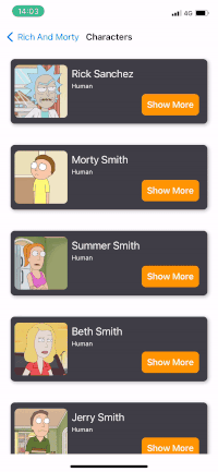
}Our result for the Characters screen will be as shown.
Self-Resizing SwiftUI Cells inside UITableView (Episodes)
Now it’s time for UITableView. We will use SwiftUI view with cell swipe support, which you can resize as well.
Using UITableView is much easier than UICollectionView. You just have to set “selfSizingInvalidation” to “enabledIncludingConstraints”. As we said on the UICollectionView side selfSizingInvalidation is enabled by default but we set it to “enabledIncludingConstraints” so that it can be resized in all auto layout changes. Even ready for self-resize.
final class EpisodesController: UIViewController {

    private lazy var tableView: UITableView = { [weak self] in
        let tableView = UITableView()
        tableView.separatorStyle = .none
        tableView.allowsSelection = false
        tableView.translatesAutoresizingMaskIntoConstraints = false
        tableView.register(EpisodeTableViewCell.self, forCellReuseIdentifier: EpisodeTableViewCell.description())
        tableView.delegate = self
        tableView.dataSource = self
        tableView.selfSizingInvalidation = .enabledIncludingConstraints
        return tableView
    }()
}
We place our own SwiftUI view instead of the cell’s own contentView via UIHostingConfiguration. In order to add swipe action, we add the feature of SwiftUI view by adding a modifier. In “.swipeAction”‘s they get SwiftUI views into their content. The rest is traditionally deleting the cell via the UITableView with output delegation.
If you want to trigger our cell’s resize manually, you can trigger invalidateIntrinsicContentSize(). Also it’ll provide the ability to resize without animation in the part I put in the comment line.
import UIKit
import SwiftUI
protocol EpisodeTableViewCellOutput: EpisodeViewOutput {
func didTapDelete(_ cell: EpisodeTableViewCell)
}
final class EpisodeTableViewCell: UITableViewCell {
weak var output: EpisodeTableViewCellOutput?
override func prepareForReuse() {
super.prepareForReuse()
contentConfiguration = nil
}
func configure(with viewModel: EpisodeTableViewCellViewModel) {
self.contentConfiguration = UIHostingConfiguration {
EpisodeView(output: self, isExpanded: viewModel.isExpanded, viewModel: viewModel)
.swipeActions(allowsFullSwipe: true) {
Button("Delete") { [weak self] in
guard let self else {
return
}
self.output?.didTapDelete(self)
}
}
.tint(Color.red)
}
.background(.white)
.margins(.all, 20)
}
}
extension EpisodeTableViewCell: EpisodeViewOutput {
func didTapButton(with viewModel: EpisodeTableViewCellViewModel, isExpanded: Bool) {
output?.didTapButton(with: viewModel, isExpanded: isExpanded)
//UIView.performWithoutAnimation {
// self.invalidateIntrinsicContentSize()
//}
}
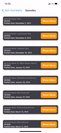
}Our UITableView example is complete:
Conclusion
With iOS 16, UITableView and UICollectionView now have a much more flexible structure. Now we can use the views developed with UIKit and SwiftUI together. With your knowledge on the UIKit side and the innovations on the SwiftUI side, there is a lot to discover. You can find the sample project below. Stay tuned.
https://github.com/ferhanakkan/SwiftUIInUICollectionViewAndUITableView
Where to Go From Here?
Check Apple’s Documentation for more detailed description on how we can use SwiftUI inside UICollectionView and UITableView.