WWDC25: Build a UIKit App with the New Liquid Glass Design
Apple introduced the new iOS user interface during WWDC25. One of the most exciting of these was the Liquid Glass design. Unlike the previous design, this design allows us to achieve a liquid glass look. Now let’s take a pleasant journey on how to make this new liquid glass design with UIKit.
Are you wondering how you can make Liquid Glass Design in SwiftUI? I leave a link below.
Liquid Glass Design with SwiftUI: https://appcircle.io/blog/wwdc-25-build-a-swiftui-app-with-the-new-design
Tab Views and Split Views
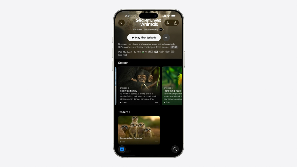
Now TabViews look even better with Liquid Glass technology. But what happens when we scroll down?
tabBarController.tabBarMinimizeBehavior = .onScrollDown
The one-line UIKit code above allows us to do this!
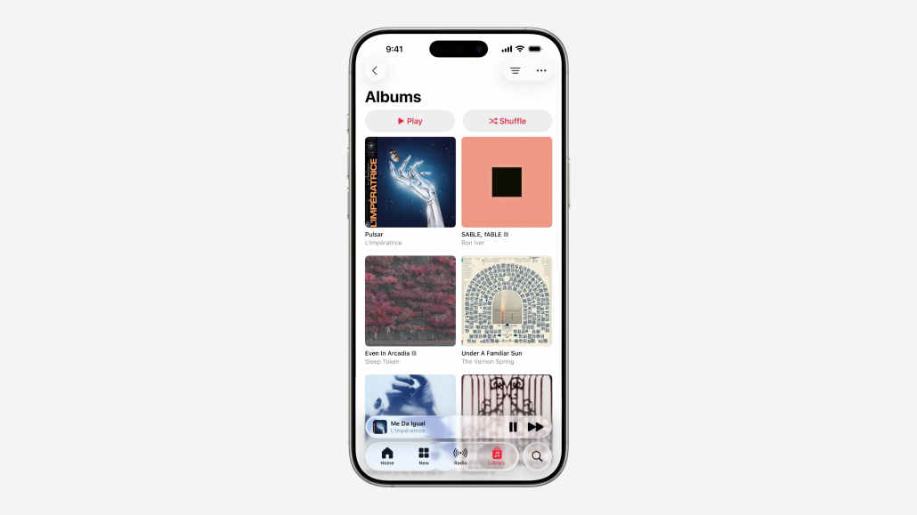
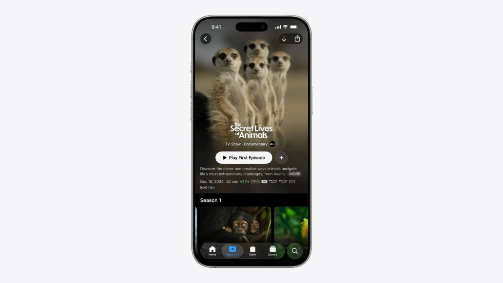
Let’s see how the TabBar is hidden when the user swipes down, using an example from the Apple Music app.
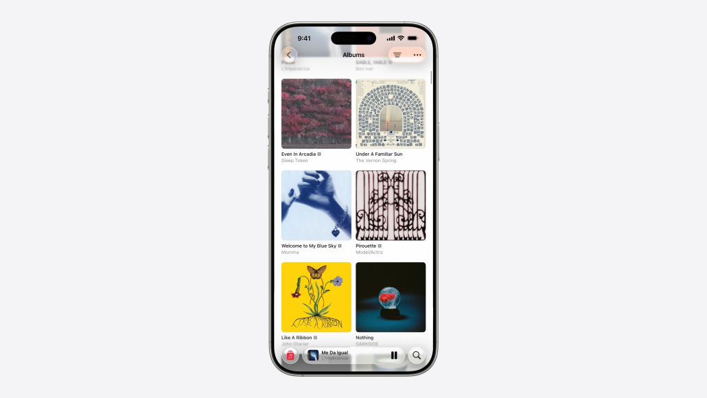
When the user wants to scroll down the content, we eliminate the TabBar and give more space to the content.
Here are the UIKit codes that make the above interface changes.
let playingView = NowPlayingView()
let accessory = UITabAccessory(contentView: playingView)
tabBarController.bottomAccessory = accessory

// Update the accessory with the trait

registerForTraitChanges([UITraitTabAccessoryEnvironment.self]) { (view: MiniPlayerView, _) in
  let isInline = view.traitCollection.tabAccessoryEnvironment == .inline
  view.updatePlayerAppearance(inline: isInline)
}

//Automatic trait tracking with updateProperties()
override func updateProperties() {
    super.updateProperties()
    let isInline = traitCollection.tabAccessoryEnvironment == .inline
    updatePlayerAppearance(inline: isInline)
}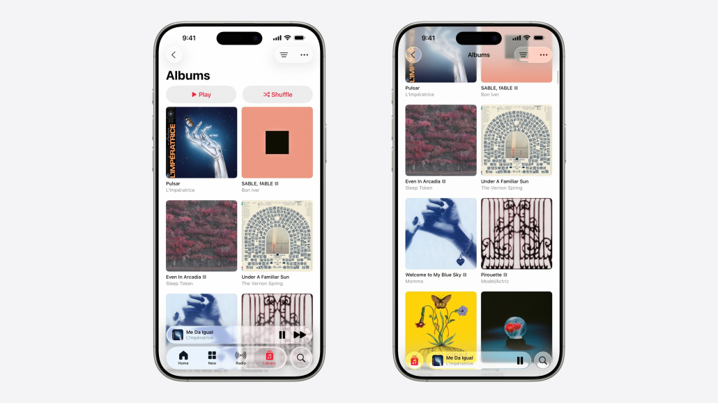
Let’s compare how hiding the TabBar helps the user experience when navigating through content. How great it is!
Navigation and Toolbars
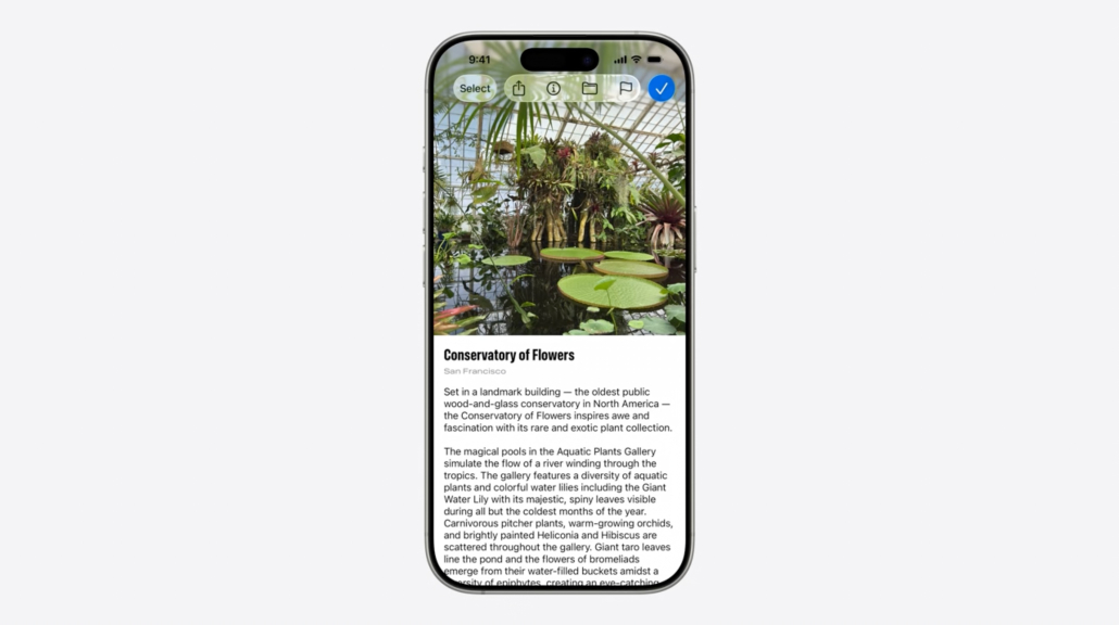
Designing a custom Navigation Bar was always fun. Even more fun after WWDC25!
Now it is very easy to separate buttons with .fixedSpace(). In this function, enter the index number of the button to be separated from the Navigation Bar. And that’s it!
Of course, it is possible to further customize our custom structure. With UIKit we can change the icon, background color and style of the buttons in the NavigationBar to get a more unique structure.
let flagButton = UIBarButtonItem(image: .init(systemName: "flag.fill"))
flagButton.tintColor = .systemOrange
flagButton.style = .prominent

navigationItem.rightBarButtonItems = [
    doneButton,
    flagButton,
    folderButton,
    infoButton,
    .fixedSpace(0),
    shareButton,
    selectButton
]
Since we want to customize the flag button in our NavigationBar structure, we give a style and foreground color to the button and thus get a custom look.
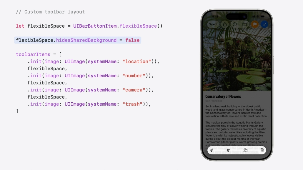
Designing an elegant ToolBar with UIKit, like NavigationBar, is not difficult at all. With this structure, the user will be able to access many features from a single screen. Did you notice the blur effect in the background of the ToolBar?
Let’s see how it’s done.
let flexibleSpace = UIBarButtonItem.flexibleSpace()

flexibleSpace.hidesSharedBackground = false

toolBarItems = [
    .init(image: .init(systemName: "location")),
    flexibleSpace,
    .init(image: .init(systemName: "number")),
    flexibleSpace,
    .init(image: .init(systemName: "camera")),
    flexibleSpace,
    .init(image: .init(systemName: "trash"))
]
We create a variable called flexibleSpace and disable the hidesSharedBackground property of this variable to provide the blur effect you see.
Then we assign the buttons we created to the toolBarItems variable to get a stylish ToolBar look.
Search
One of the prominent features after WWDC25 was SearchBar. SearchBar can now shrink and grow according to the user’s touch or search and can be integrated into structures such as ToolBar and NavigationBar!
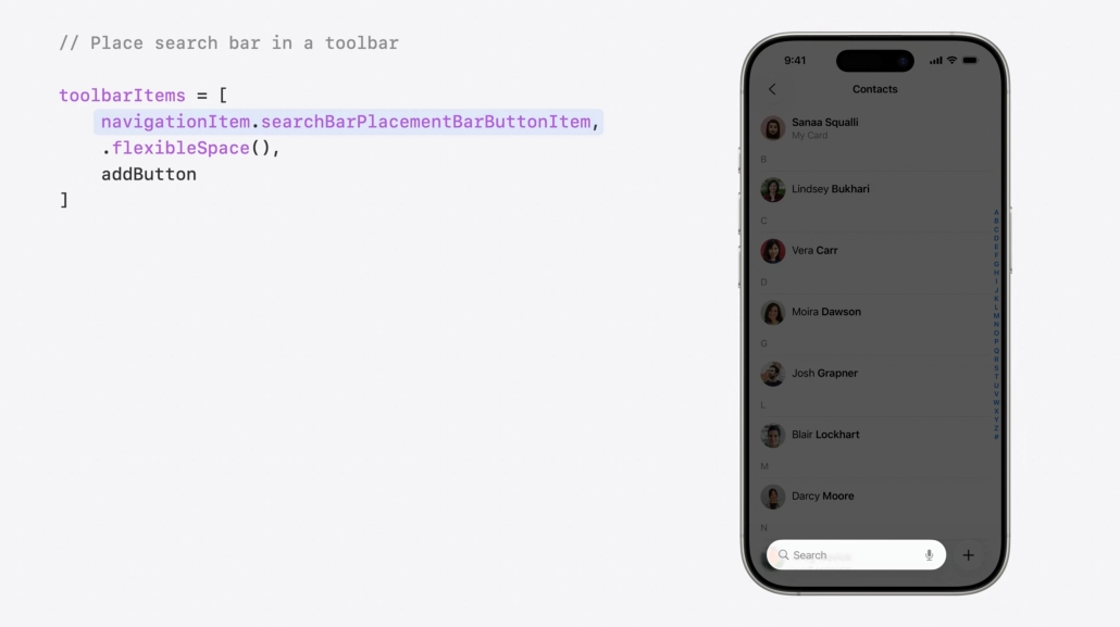
As we can see here, a SearchBar and AddButton are integrated into the ToolBar structure. Although this was not possible until today, after WWDC25 it is now possible with just a few lines of code!
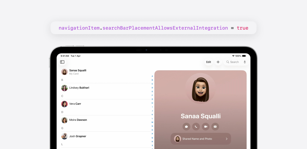
The same is true for iPadOS. Adding the SearchBar as a navigationItem to the NavigationBar structure with UIKit was quite annoying until today. After WWDC25, it is now very easy to do. navigationItem.searchBarPlacementAllowsExternalIntegration = true
That’s it!
Controls
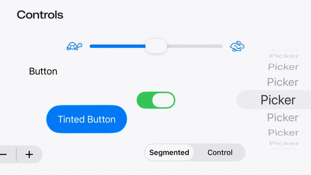
The recently talked about Liquid Glass effect has also touched UI elements such as UIButton, UISlider, UISwitch. So how hard is it to integrate the Liquid Glass effect into these UI elements with UIKit?
Let’s look at this together.
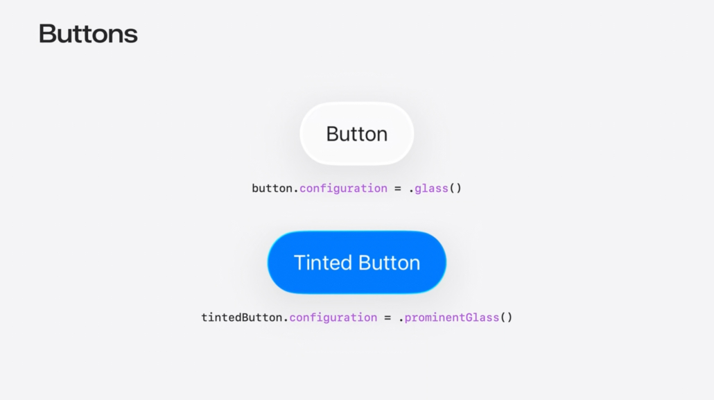
If you want to apply a Liquid Glass effect to a button, all you need to do is change the button’s configuration property to .glass() or .prominentGlass().
That’s it!
Custom Elements
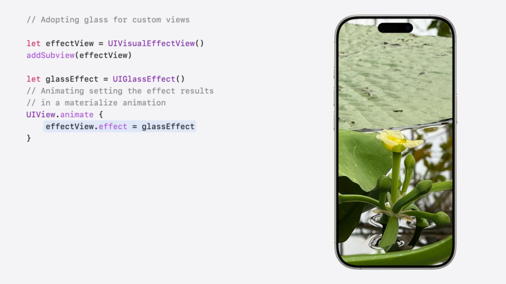
So, if we want to add a cool glass effect to the photo above and make this glass change shape and color according to the background, how can we do this with UIKit?
Now let’s look at this!
//Adopting glass for custom views

let effectView = UIVisualEffectView()
addSubview(effectView)

let glassEffect = UIGlassEffect()
//Animating setting the effect results
// in a materialize animation

UIView.animate {
    effectView.effect = glassEffect
}
In the UIKit code you see, we create a custom view and add it to the screen. Then we add a glass effect to this custom view.
If we want to round the edges of this custom view, we write effectView.cornerConfiguration = .fixed(cornerRadius) in UIView.animate {}.
Likewise, if we want to change the background color of this view, we write the code view.overrideUserInterfaceStyle = .selectedTheme in UIView.animate {}.
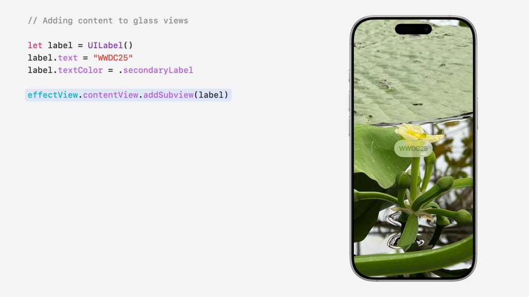
It is very easy to add WWDC25 text to this custom view with UIKit!
We write “WWDC25” in the text property of the related UILabel object and add it to our custom view with the addSubview function.
That’s it!
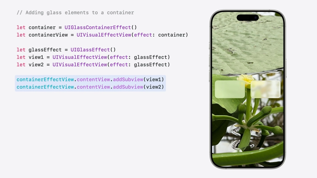
If we wanted to create 2 different custom skins and have them interact when we zoom in on each other, I hope you’ve wondered how we could do that. Let’s see how to do it.
let containerEffect = UIGlassContainerEffect()
let containerView = UIVisualEffectView(effect: containerEffect)

let glassEffect = UIGlassEffect()
let view1 = UIVisualEffectView(effect: glassEffect)
let view2 = UIVisualEffectView(effect: glassEffect)

containerEffectView.contentView.addSubview(view1)
containerEffectView.contentView.addSubview(view2)

let glassContainerEffect = UIGlassContainerEffect()
glassContainerEffect.spacing = 20
containerEffectView.effect = glassContainerEffect
UIKit pre-WWDC25 vs UIKit post-WWDC25
I am sure you have wondered what improvements and innovations have come to UIKit before and after WWDC25. Let’s observe these innovations in a concrete table.
| Feature | Before WWDC25 (iOS 18 and earlier) | After WWDC25 (iOS 19 / UIKit Updates) |
|---|---|---|
| Design Language | Static, opaque UI components with minimal depth | Liquid Glass: translucent, depth-aware surfaces with refraction and glass-like appearance |
| Tab and Split Views | Fixed tab bars and rigid split views | Tab bars float over content and can hide; split views support dynamic column resizing and inspector views |
| Menu Bar (iPad) | Not available; menus limited to context actions | macOS-style menu bar introduced on iPad, fully customizable via UIMenuBuilder |
| Observation | Manual UI updates via setNeedsLayout or layoutIfNeeded | @Observable enables automatic state-based updates; no manual layout calls needed |
| updateProperties Method | View updates tied strictly to layout cycle via layoutSubviews | New updateProperties allows data-driven updates outside layout cycle |
| Animations | Must sync layout manually using layoutIfNeeded before animations | flushUpdates ensures layout consistency during and after animations |
| HDR Color Support | Limited HDR rendering (e.g. UIImageView fallback only) | Full HDR support via UIColor, including exposure and tone mapping |
| Notification APIs | Notifications use NotificationCenter with userInfo dictionaries | NotificationCenter.Message introduces type-safe, structured notifications |
| App Lifecycle | Based on UIApplicationDelegate, single-window apps | UIKit now enforces UIScene lifecycle; old AppDelegate patterns are deprecated |
| openURL Behavior | Supports only custom URL schemes | Now supports opening file URLs with default system apps (e.g. Files app) |
| SF Symbols | Basic icon set with static rendering | SF Symbols 7: animated vector symbols, transitions, and gradient color support |
Summary
UIKit was among the most talked about after these radical changes after WWDC25. Of course, one of the most prominent changes in this process was the Liquid Glass effect brought to the iOS 26 operating system. A more enjoyable and passionate development process awaits iOS Developers.
For more information you can visit official documentation.
F.A.Q.
What is Liquid Glass Design?
It is a special design pattern introduced at WWDC25. This design pattern adds a liquid glass effect to the interface components and aims to provide users with a sleek and modern interface.
Can Liquid Glass design be done with UIKit?
Of course, this design pattern now has UIKit support with the latest updates.
When was Liquid Glass Design announced?
Introduced on June 9, 2025 at WWDC25.
Why choose the Liquid Glass design?
If you want to design a sleek and modern user interface, the Liquid Glass pattern might be just the ticket. This pattern allows you to apply a liquid glass effect to interface components for a cool look.

